LYN
Love Your Neighbor "LYN"
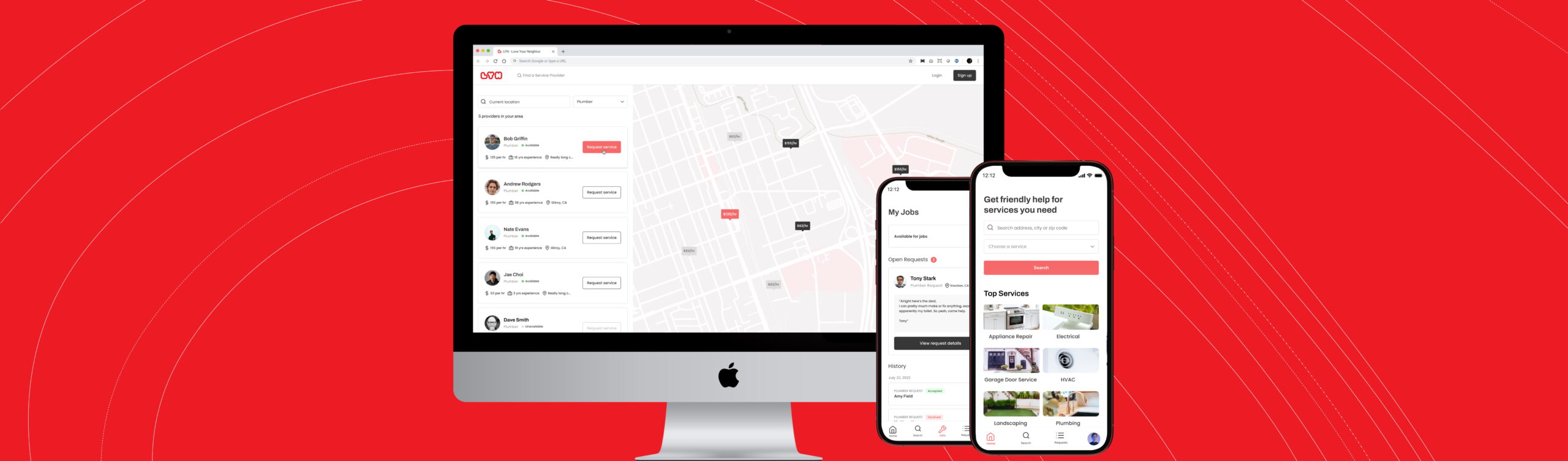
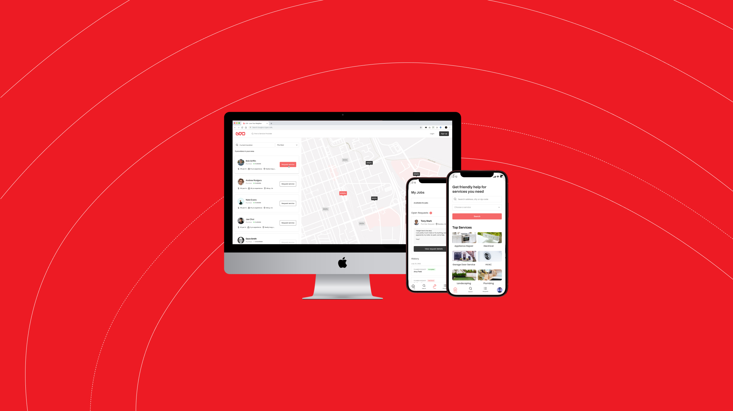
LYN is an app that brings together service providers offering a service, and end users needing a service for on-demand service needs within their community. LYN utilizes the power of neighborly recommendations to ensure the consumer always gets the best service. What differentiates LYN is that the consumer is in control, whereas most competitor apps require the consumer to submit a ton of personal information only to be hounded with emails and phone calls from 10 or more service providers.
The Problem
Consumers on average spend 15 to 30 minutes searching for the right service provider and read through an average of 10 reviews before choosing the right one. They tend to trust their neighbors recommendations more than online reviews. Today there is no solution that directly allows users to quickly and easily find plumbers, electricians, contractors, etc. that their neighbors use and recommend. LYN aims to solve this problem for consumers. For service providers, typical platforms charge high fees and they end up spending more in those fees than they receive for the jobs done. LYN’s revenue model works differently to allow service providers to maximize their earnings.
The Business Constraints
LYN, like many of my clients, is a very new startup, a small team but big ideas! With limited budget to do large sample size user testing, we decided instead to release an MVP to a set of users and speak with those users about their experience in order to iterate on the design and the feature set.
My Role
Working on a small team with the CEO and 3 engineers, my role as the solo designer was to bring this product alive. I worked from conception to dev partnership ensuring that the CEOs great ideas came to life in an easy to use platform that would keep users engaged.
Project Components
UX Design
UI Design
User Feedback
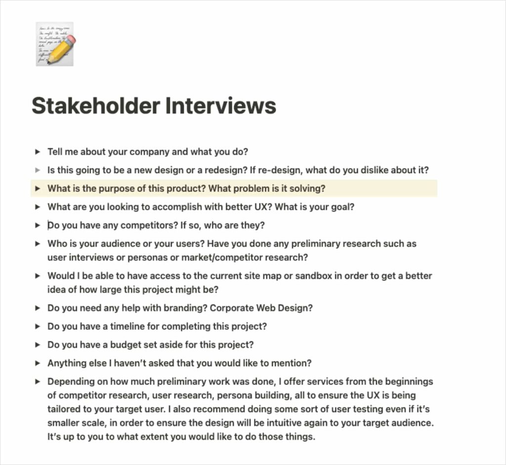
Stakeholder Interviews
At the start of this project I was brought in before any developement had begun. The idea was shared with me and it sounded like a wonderful opportunity to make something great. As I onboarded with the team, I took the time to understand the goals of the application, the problem it would be solving, and the dreams of those involved so that we could keep those goals in mind as we designed this application.
Key Insights from Stakeholder Interviews
- LYN will likely primarily be used on mobile devices, as service providers are constantly on the go. But we also wanted to give consumer users the option to use the app on the web.
- LYN has several competitors, but nothing out there today does what LYN plans to do in this industry
- LYN needs to solve several problems for both our consumer users and our service providers. Ensuring that both users can use this app seamlessly is key, with little to no context switching between users.
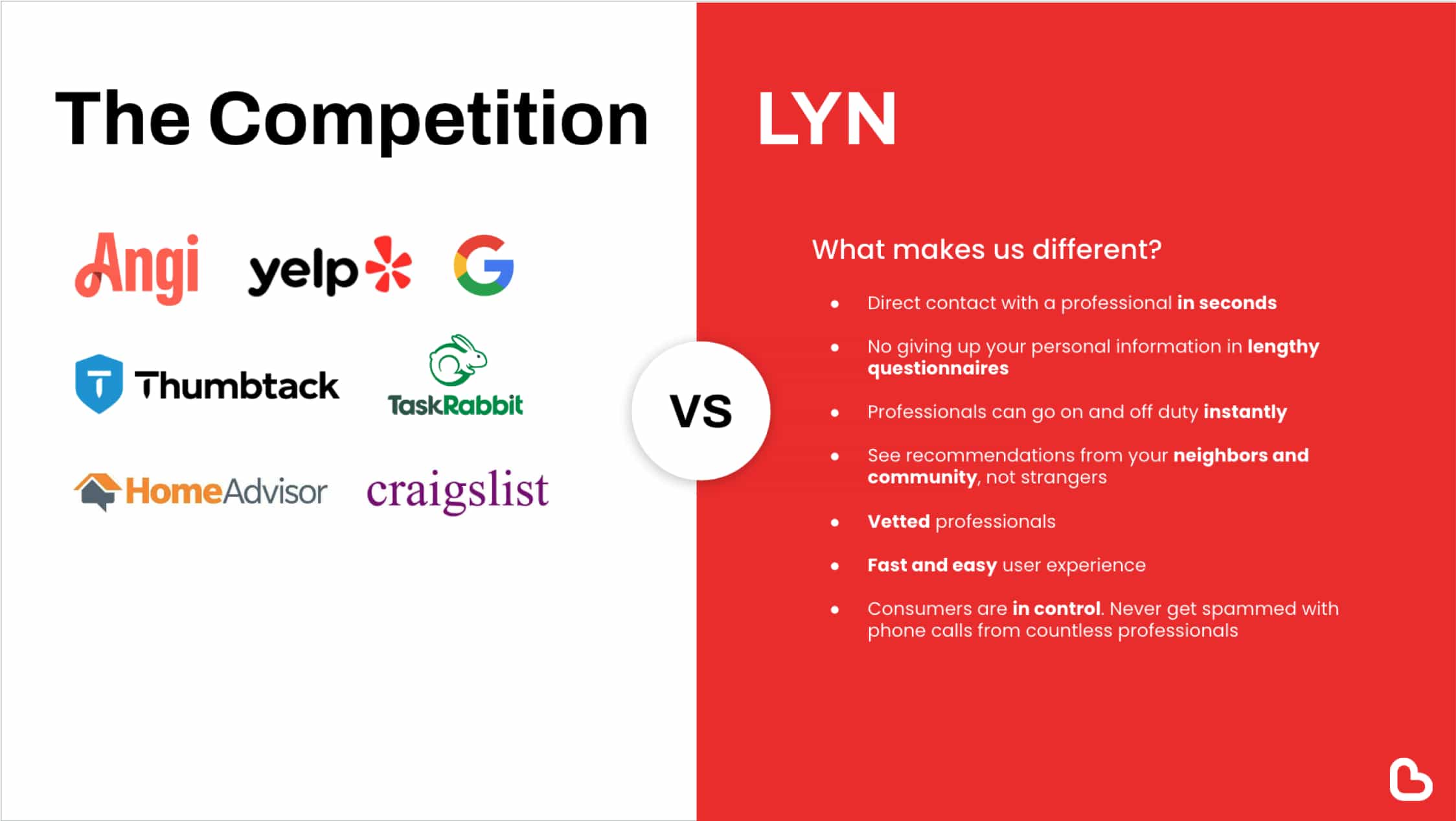
A Look at the Competitors
Before diving into ideation I wanted to get a good idea of how users go about finding a service provider today. There are many competitors our there that have similar offerings, such as Angi and Thumbtack, but all of them work the exact same way and I noticed have one major issue that remains unsolved. In a majority of these apps, users are required to answer a long quiz about their problem, anywhere from 5 to 10 questions. After this, they require the user to give up their personal information before delivering any results to the user. This means the user must invest two things in order to get a reward (to see available service providers).
- A time commitment to fill out all the information
- Their contact information and privacy - they are giving up the power to find the provider that is right for them
If a user even made it that far, they are only then presented with a list of service providers they can reach out to. Not only this, but by giving their contact information users are often hounded with emails, phone calls, and text messages for weeks, often times even after the job was already completed.
This is a major gap I saw that needed to be solved, and frankly is quite easy to solve with good UX design.
Visual Inspiration
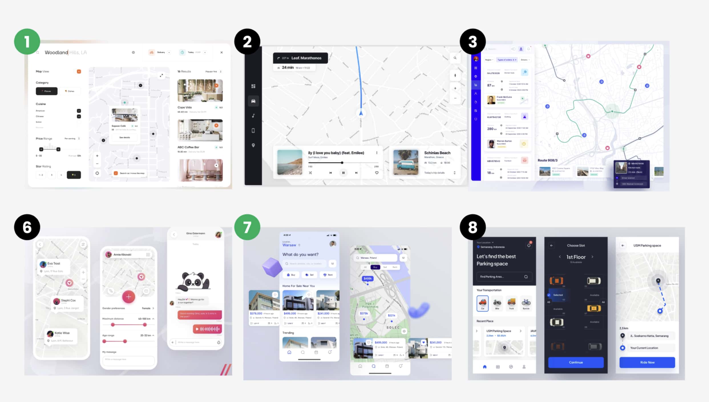
Through working with this client I was able to learn a lot during my discovery phase about the expectations of the app, and helped to uncover other ways we could differentiate ourselves. Before digging into wireframing, I wanted to get a good indication of the visual style the client was looking for. I provided some inspiration and recommendations on style we should go for, and the client picked #1 and #7 as the design direction they wanted.
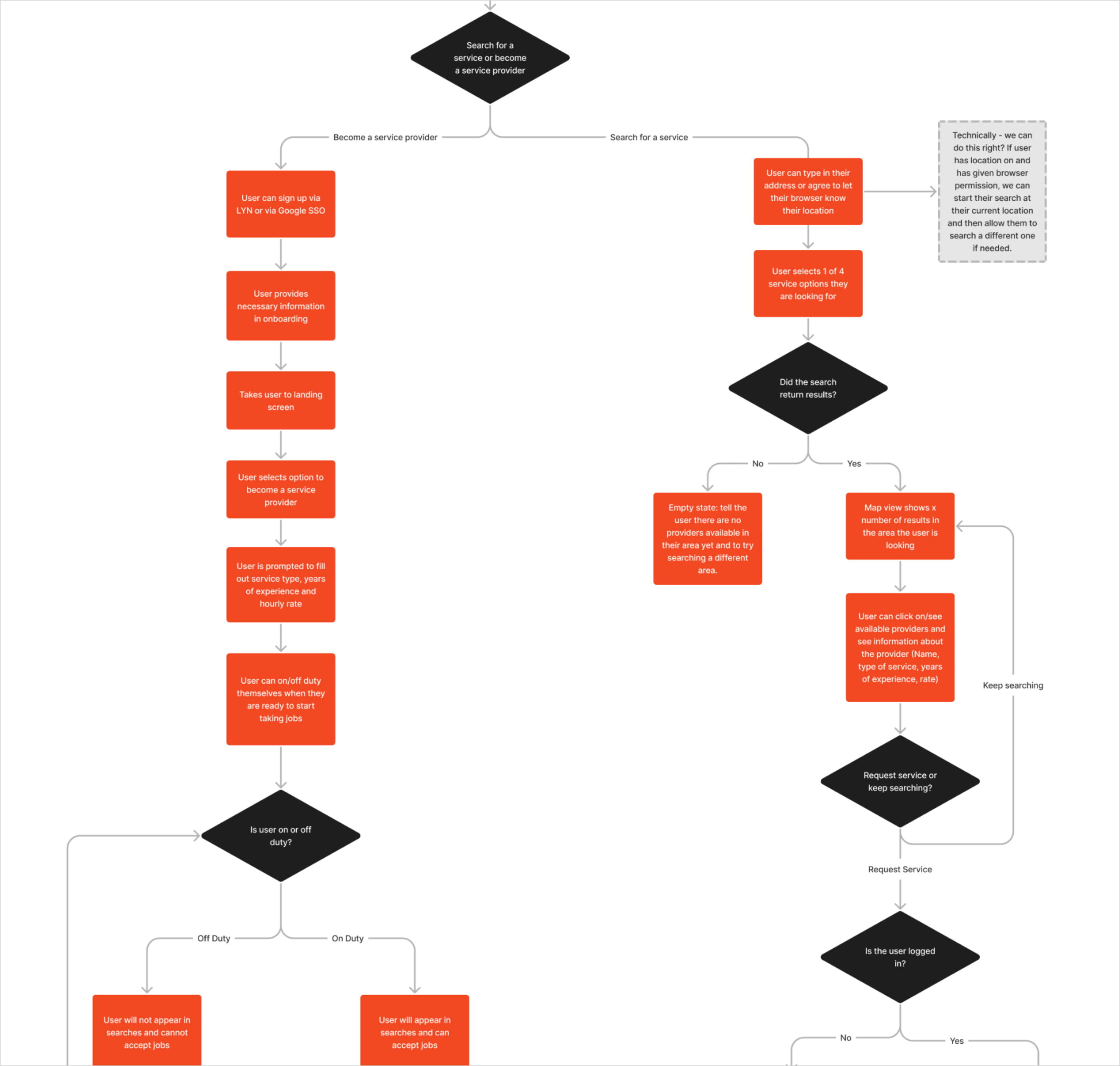
User Flows
In the ideation phase, I hosted several workshops with the CEO and engineers to talk about what a user's journey might look like throughout this app. Coming out of these workshops I created several different diagram user flows. We used these as a way to all align on what the user would do, forks in the flow, etc. Once we were all aligned on these, I used these as a starting point for wireframing some flows out.
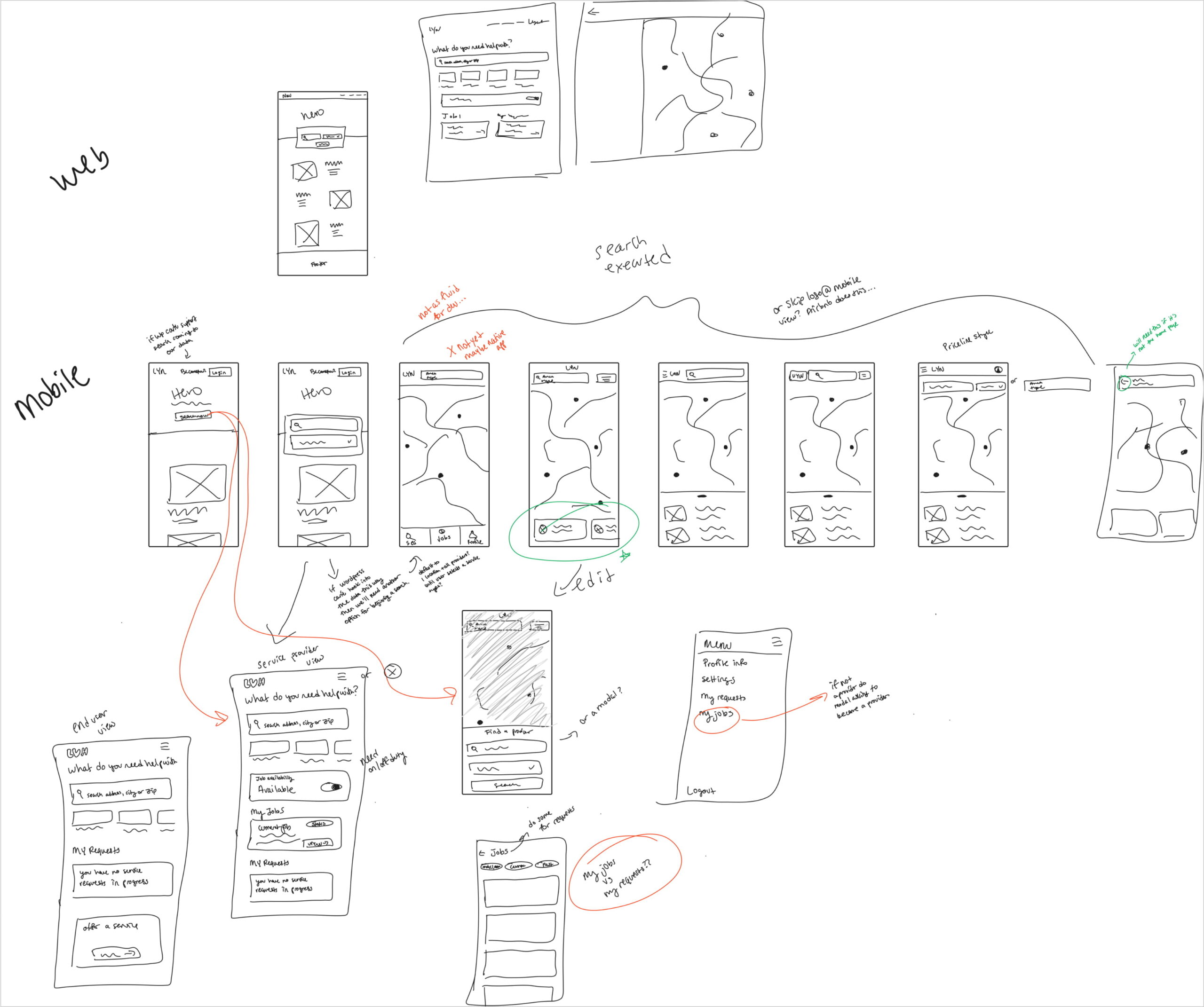
Idea Sketching
Before getting into detailed wireframes I like to do a series of ideation via hand sketches in figjam. This allows me to get all the options out there for how this app might look or work. It's important during this phase to look at both mobile and web, and ensure the design direction you go with can scale well for both. You'll see a lot of my notes relating to how things might work. After several iterations, I finally get to the direction I want to go in to move onto low-fidelity wireframing.
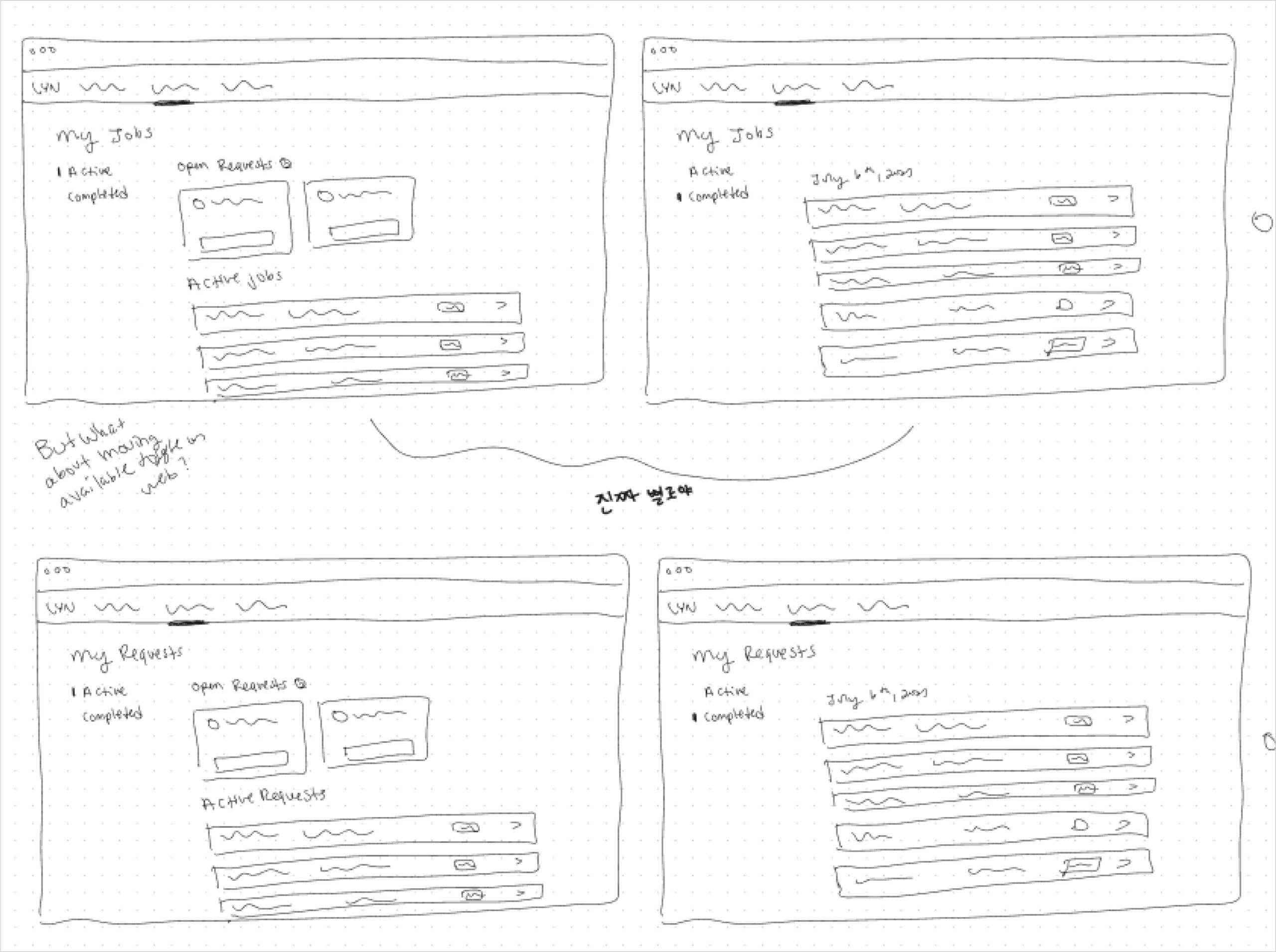
Low Fidelity Wireframes
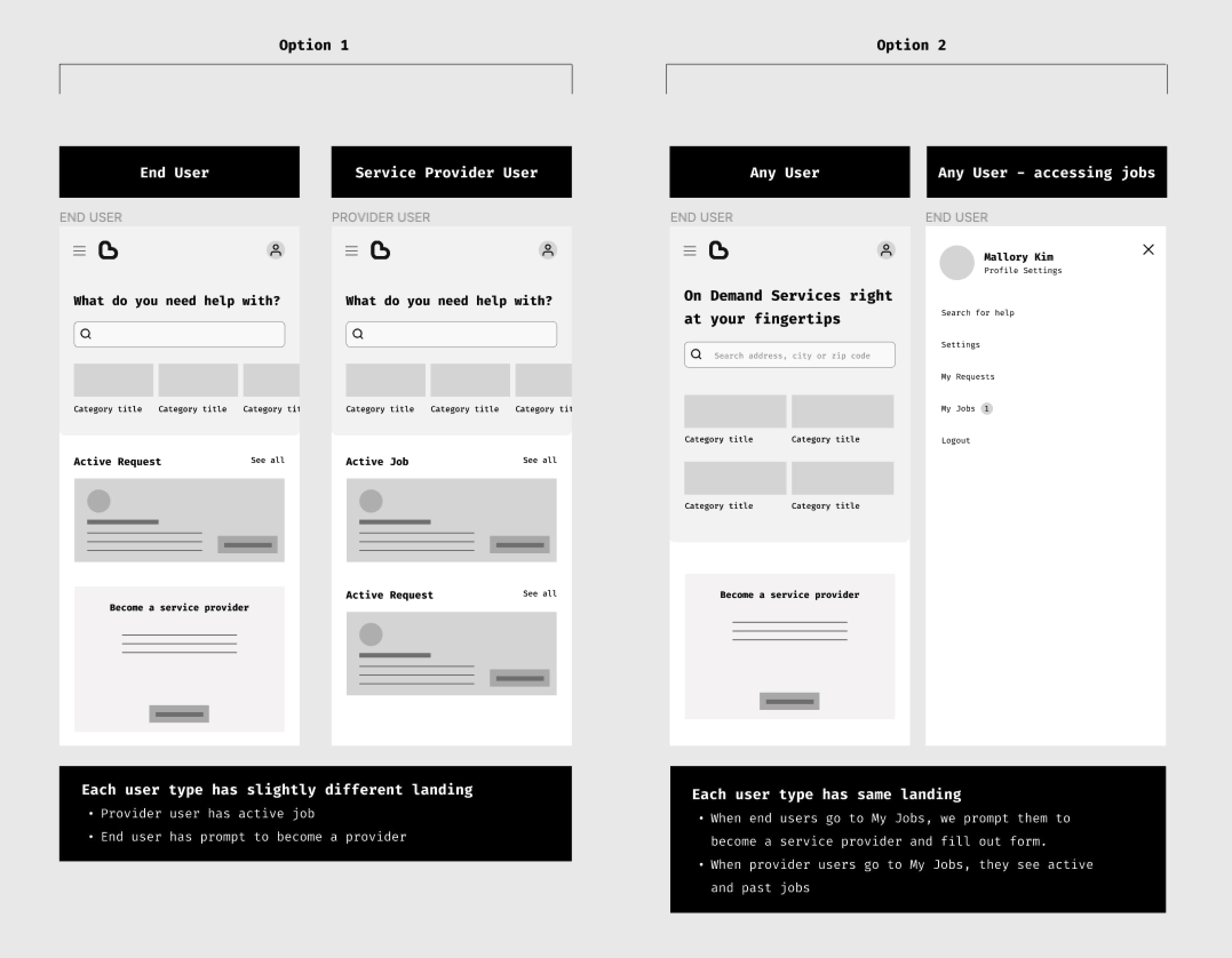
In the low fidelity wireframing stage there was still a bit of ideation that took part. Particularly in this image above, we knew we wanted service provider users to also use the app like they are a consumer, so I took a look at what that could look like in the design and came up with 2 options which I used to share with the CEO and engineer. Visualizing the UX in this way is really helpful for communicating intent to stakeholders and helps to make quick decisions.
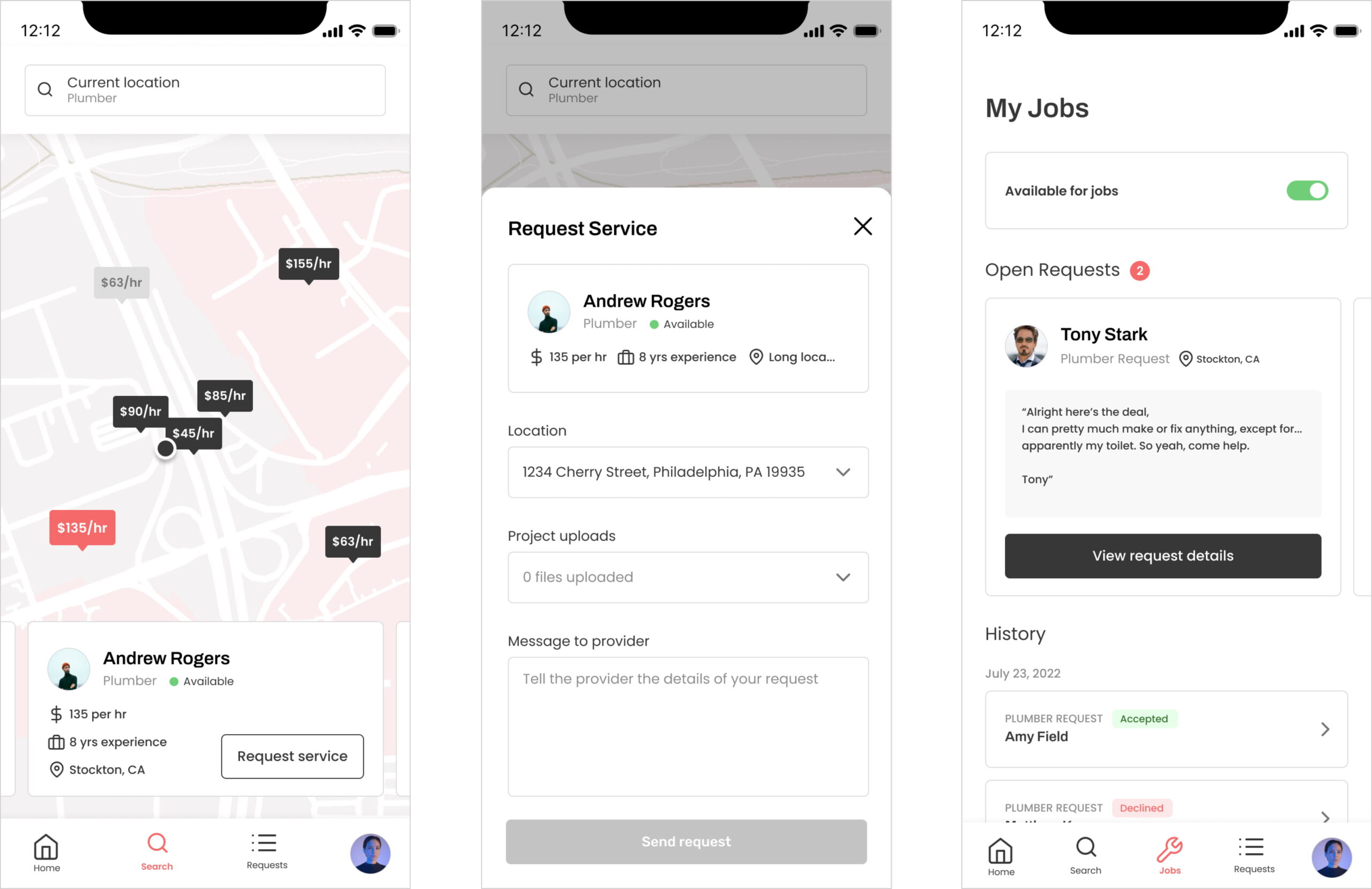
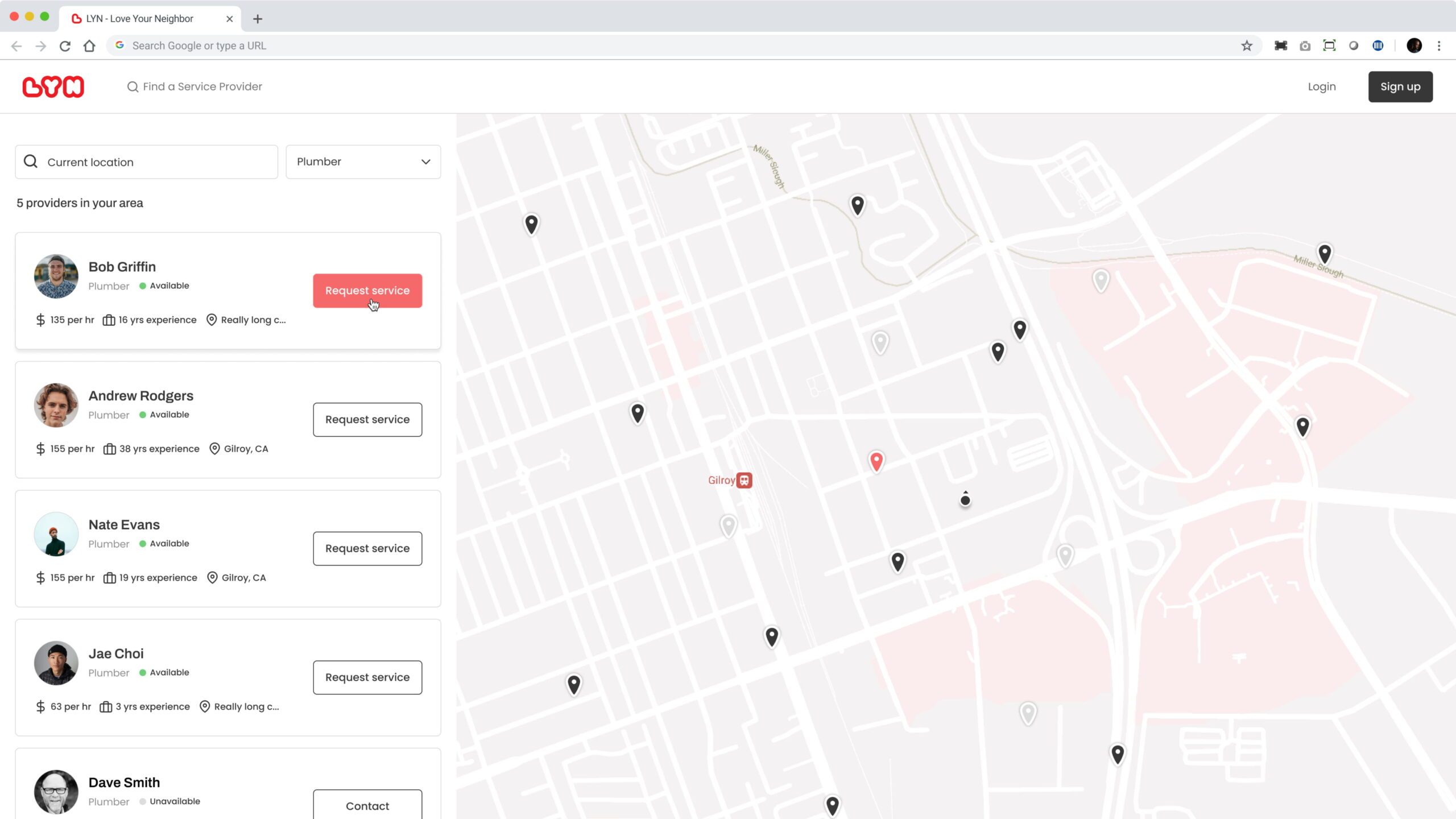
High Fidelity Designs
The high fidelity stage is where all the up front work ideating through sketches and lowfi wireframes was married with the visual direction chosen by the client. While not every flow was created in lowfi, every single part of the app was created in high fidelity in order to fully communicate every single encounter a user might have with this app. Throughout this process I met weekly with the client and the engineers to get any feedback on the designs, the UX, and also tech feasibility. The CEO was also able to show some of these preliminary designs to some users who were anticipating the use of this app and we got really great feedback.
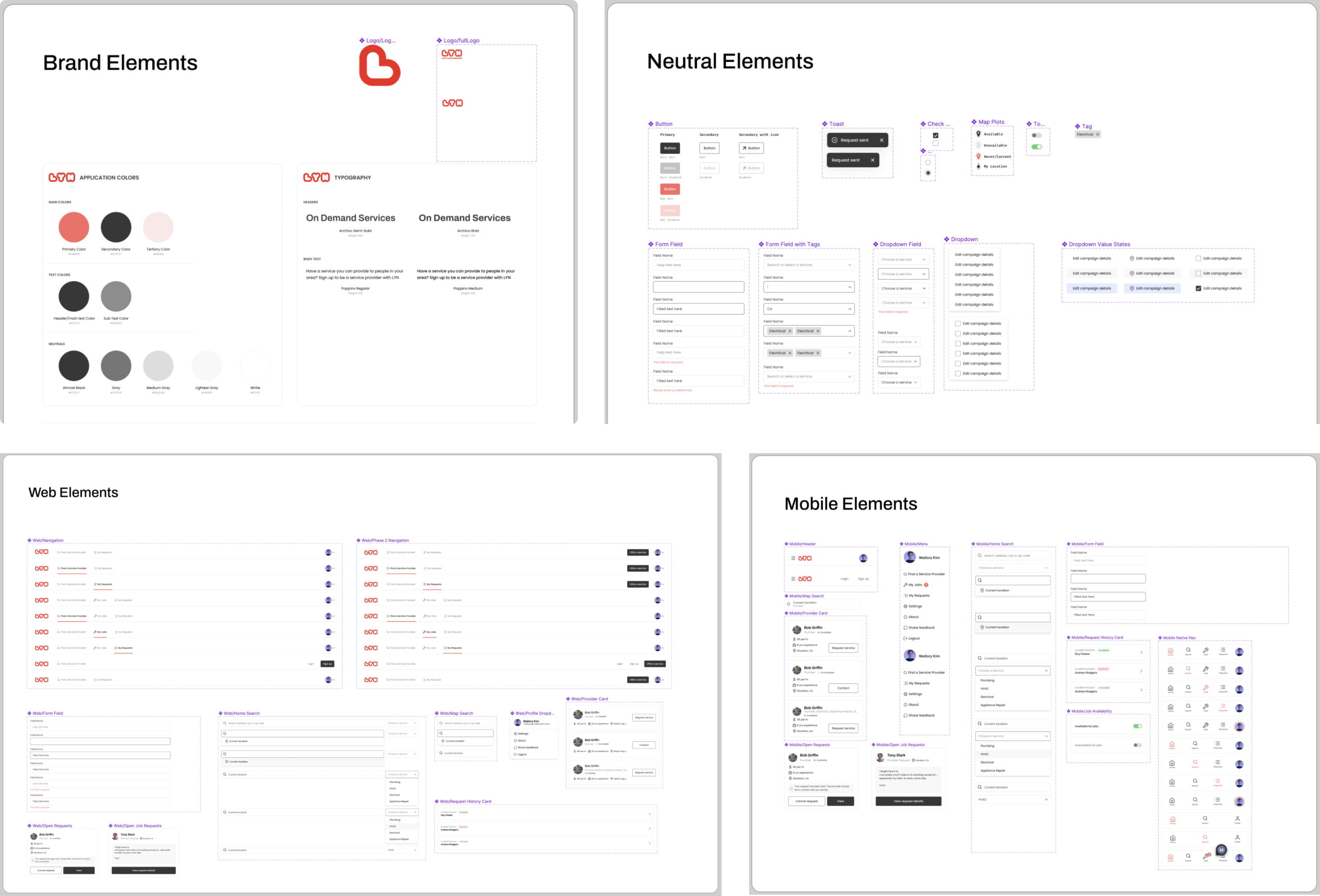
Component Library & Style Guide
While designing for high fidelity I took the time to create a full component library for the project. This of course allowed me to move extremely quickly if things changed, otherwise I'd be updating components on hundreds of screens. This also proved significantly valuable for engineers, as they could go to the component library to see the spec for different states of components variables.
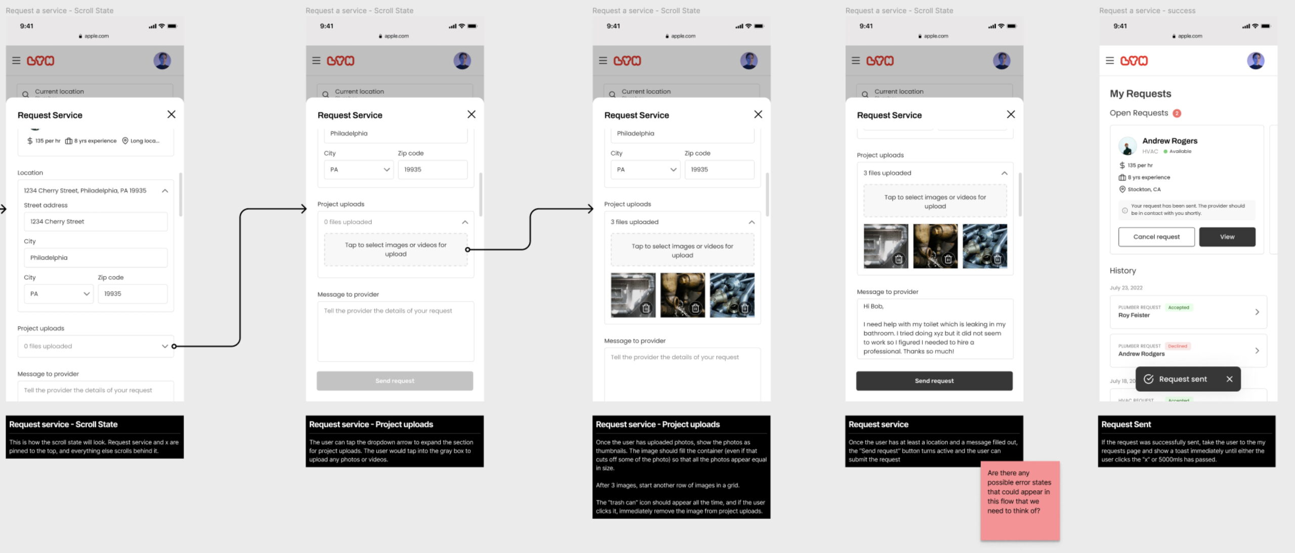
Developer Spec
Delivering a design is only half the equation when it comes to ensuring your users have a great experience with your app. It's equally important to properly document your designs and work with developers so that the design holds its intention all the way through implementation. For every single design on the figma board I left notes with detailed spec for things like scroll states, error state, etc so that engineers knew exactly what to do with the design. We also kept in touch through weekly demos, and they gave me early access through firebase so that I could play with the app and point out anything that didn't look quite right.
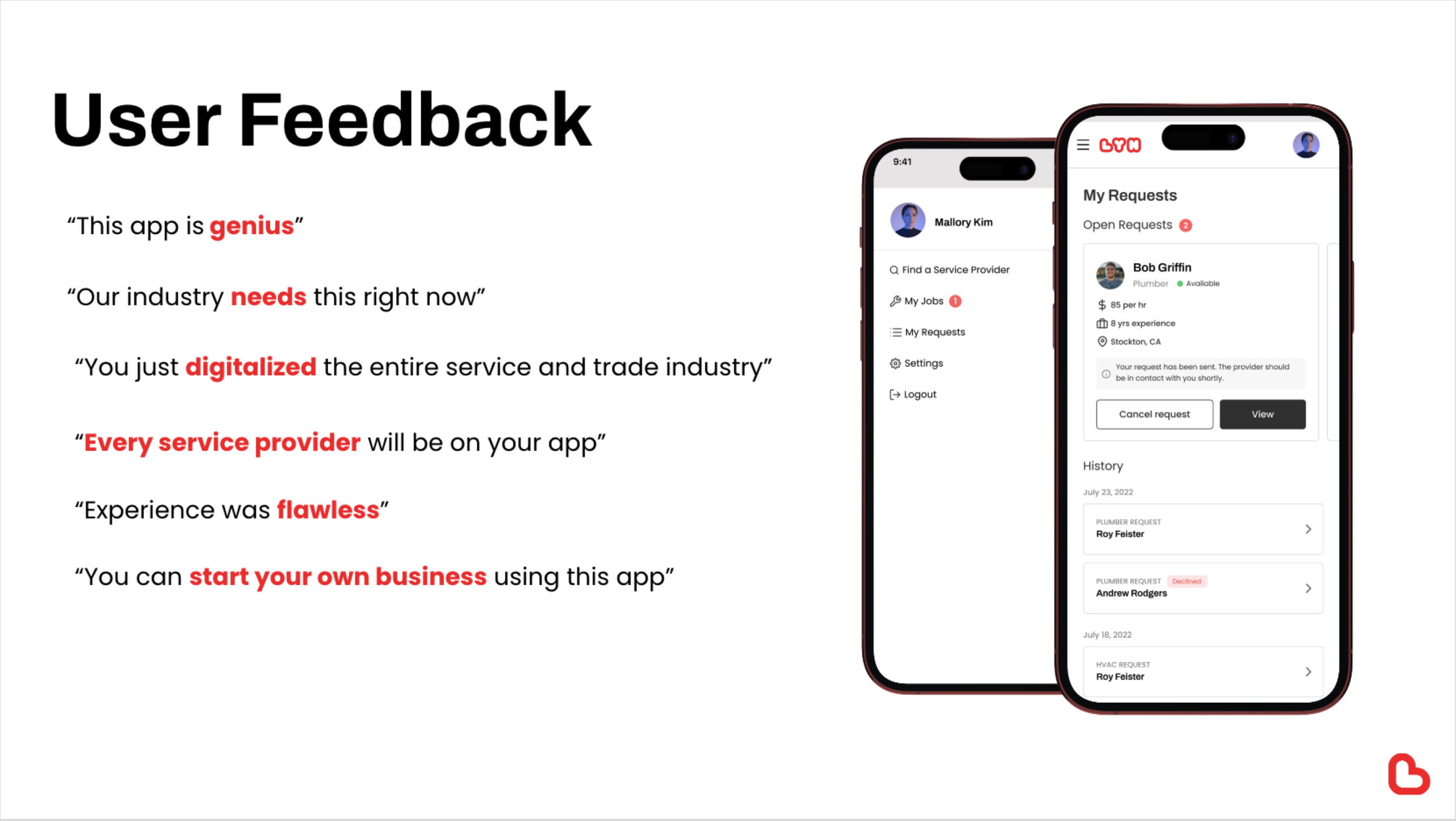
User Feedback
Once we had the MVP in a good place, we released a beta version of the app to a small set of users (about 10). The users were mostly service providers and some consumers. We asked them to use the app for a few weeks, knowing that usage might be limited before enough service providers were on the app. After use, we asked users questions about their experience using the app and what they'd like to see added or changed.
Major Insights
- A majority of the users provided unprompted feedback that the design was intuitive and easy to use. There were some usability concerns with the process of getting from the home page to the map to search, which was swiftly corrected in the designs for the follow up version.
- Many users stated that they wanted the ability to send a link to a service provider to their neighbor or their community, and the service providers wanted to be able to see when someone recommended them. Other users suggested the idea of implementing a referral bonus, which is on our roadmap.
- The biggest gap the MVP had not yet filled was payment processing. Consumers wanted a way to finish the transaction within the app, and service providers wanted to be able to easily generate estimates and invoices and receive payment for the jobs all right within the app.
- Several other feature requests came out of the feedback that are being prioritized and added to the roadmap.