Fitness Supplements Quiz
Retail Supplements Quiz
For the privacy of this client all logos have been removed and the name of the client will not be revealed in this case study. A gym client came to us wanting to introduce digital signage within their gym. The main issue that they were facing was low sales of their supplements within their gym’s micro store. In order to solve this business problem with digital signage, we started at the root cause, identifying the details around the main issue. Once we were able to uncover the problem the client was facing, the team was able to ideate on a solution and pitch it to the client.
The Problem
This client came to us with one very specific problem, they wanted to increase sales of their supplements within the gym’s micro store. Part of my job, along with a researcher, was to identify reasons why gym visitors did not want to purchase supplements in this gym.
The Business Constraints
This project was a pitch to a client, versus a paid opportunity. The client was shopping around for solutions to their problem and our goal was to put something in front of the client to potentially win their business. Due to the nature of this project there was a strict timeline that introduced an element of speed, resulting in rapid research, designing, and prototyping, with very minimal testing.
My Role
Working with both a researcher and a visual designer, my role was to take the research, and turn it into insights to inform the UX and the design. I lead the design from persona building all the way to high fidelity comps and prototyping.
Project Components
User Research
UX Design
UI Design
Up-front Research
Before getting a chance to sit down with the client and ask questions, a researcher on my team dug deep into this client's google reviews, website, mobile app, and product reviews to get a good understanding of their client base and their brand.
Key Insights from our Research
The main reasons customers didn't purchase products from the gym:
- Customers were uninformed about pricing, and deals and labels were very unclear.
- Many customers were extremely overwhelmed by the amount and variety of products that they didn't know which ones to choose and there was often no staff available to answer their questions.
Personas
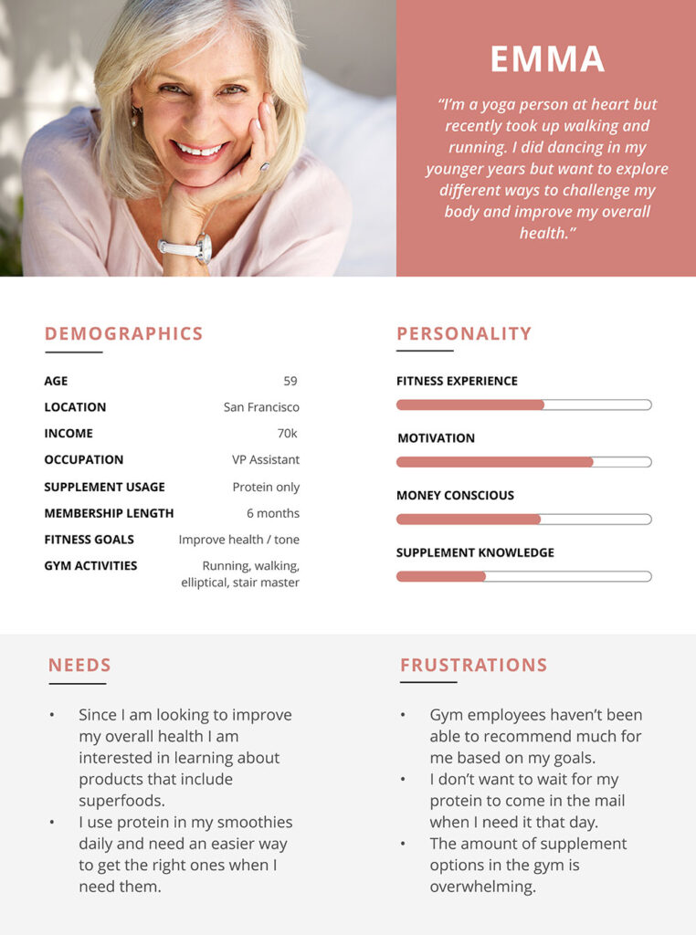
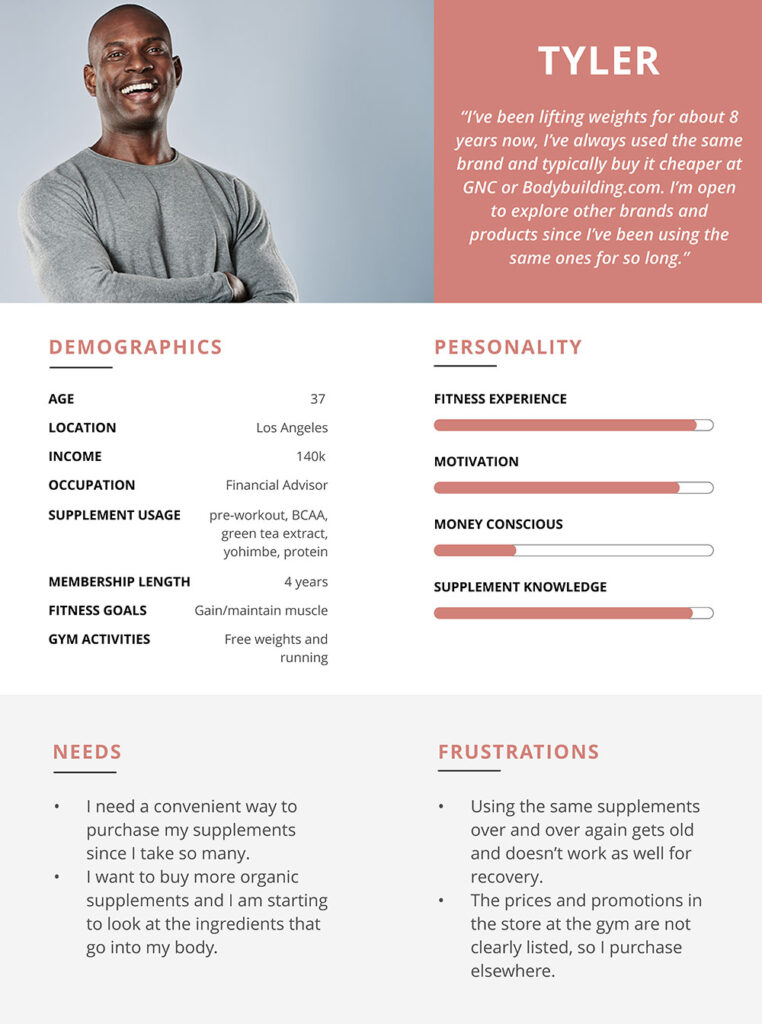
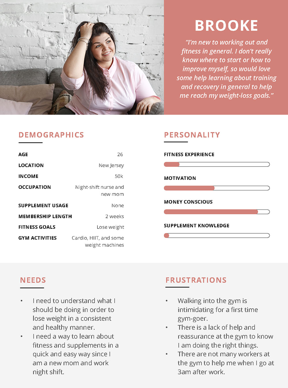
From the data collected by the researcher both on this gym's customers and gym-goers in general, I was able to identify 3 key personas that we then used to inform the solution and the UX.
The personas you see above are Brooke, who is new to fitness and needs help with education. Another persona, Tyler, has been weightlifting for 8 years, but he likes to switch up his types of supplements to help with recovery and cares about the ingredients list. The last persona, Emma, has low-intensity workouts but she uses protein in her smoothies every day. She wants a convenient way to purchase her supplements when she needs them and looks for recommendations for her ever-changing exercise regime.
Customer Journey Map
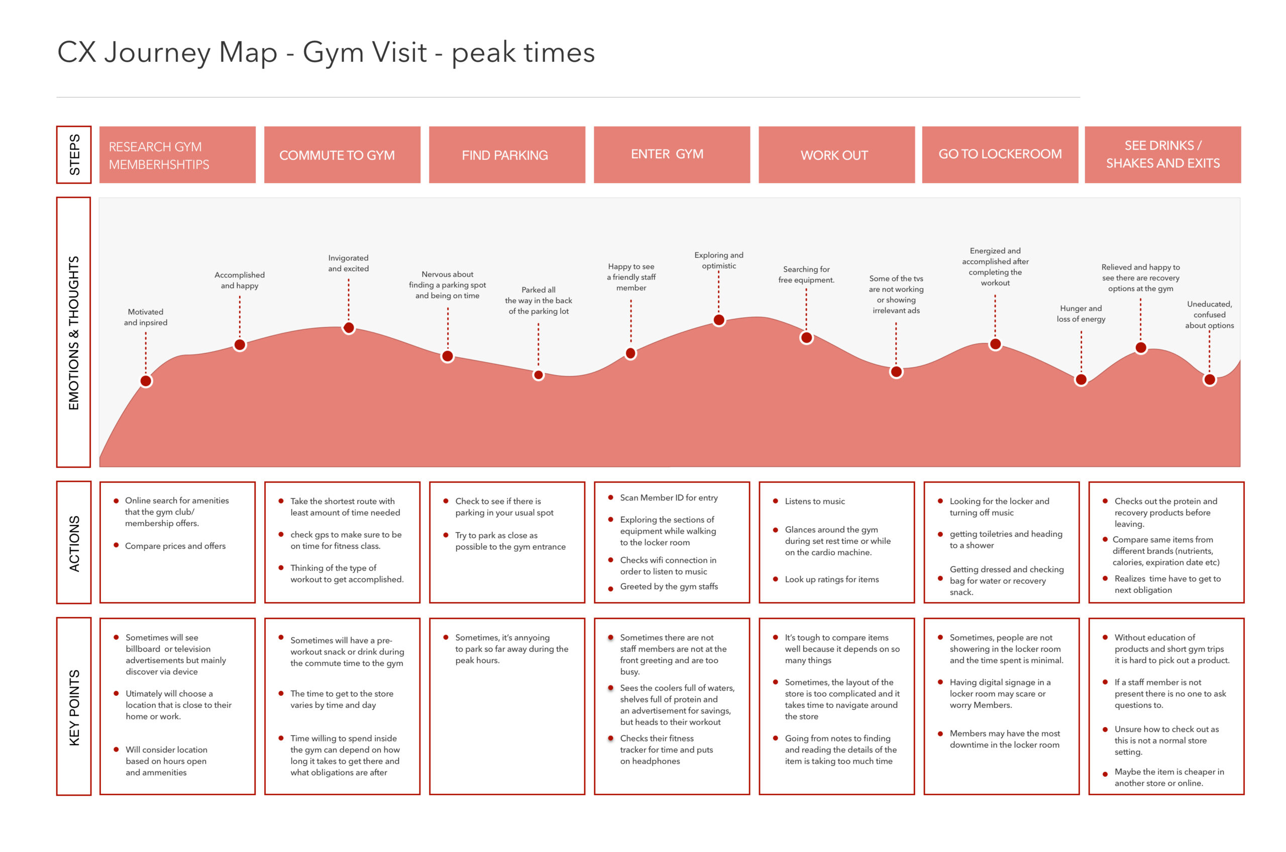
The researcher on the team was able to visit the location of this gym and execute field studies to document the paths of these gym-goers. From this field study along with the initial research, the researcher developed a customer journey map that guided us in understanding the flow of the physical space and the typical paths their gym-goers typically take. I then identified further customer pain points and discovered the opportunities for improvement in the current flow, which then allowed me to craft a better user experience that filled those gaps.
User Flow and Information Architecture
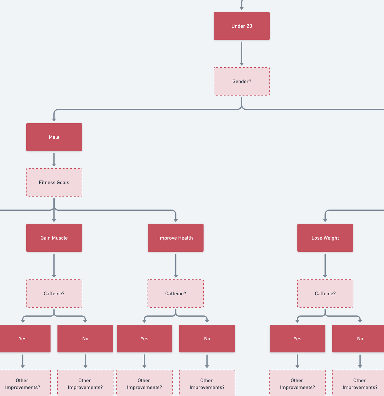
Our research made us realize that we needed to create a solution that would educate users on supplements, and filter out all the supplements that were not relevant to them since there was such an overwhelming variety. The team started to ideate on a touch screen solution that asked the customer a few questions and then personalizes the results based on the customer's responses. The client loved this idea and was then able to give us detailed information about all the products they carry.
After receiving this detailed information, I started to ideate on what those questions would be in the quiz, finding the happy medium that would help each persona with their goals and needs, but not be too time-consuming or intimidating. I then completely mapped out all questions and answers to then show the results for every combination of answers a user might submit.
Low-fidelity Wireframes
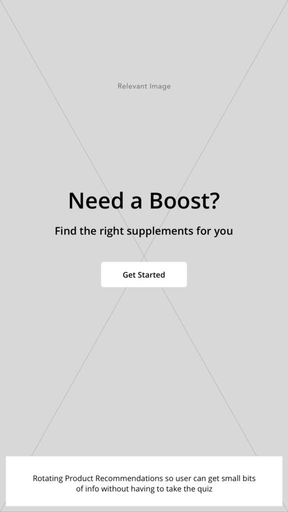
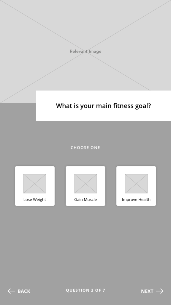
After mapping out all the questions and details of this quiz, I moved on to low fidelity wireframes. These wireframes were used to show the client progress and were used to validate the ideas of the team. Only a few screens were done in low fidelity before feeling confident in the design as a team and moving onto high fidelity.
High-fidelity Comps and Prototyping
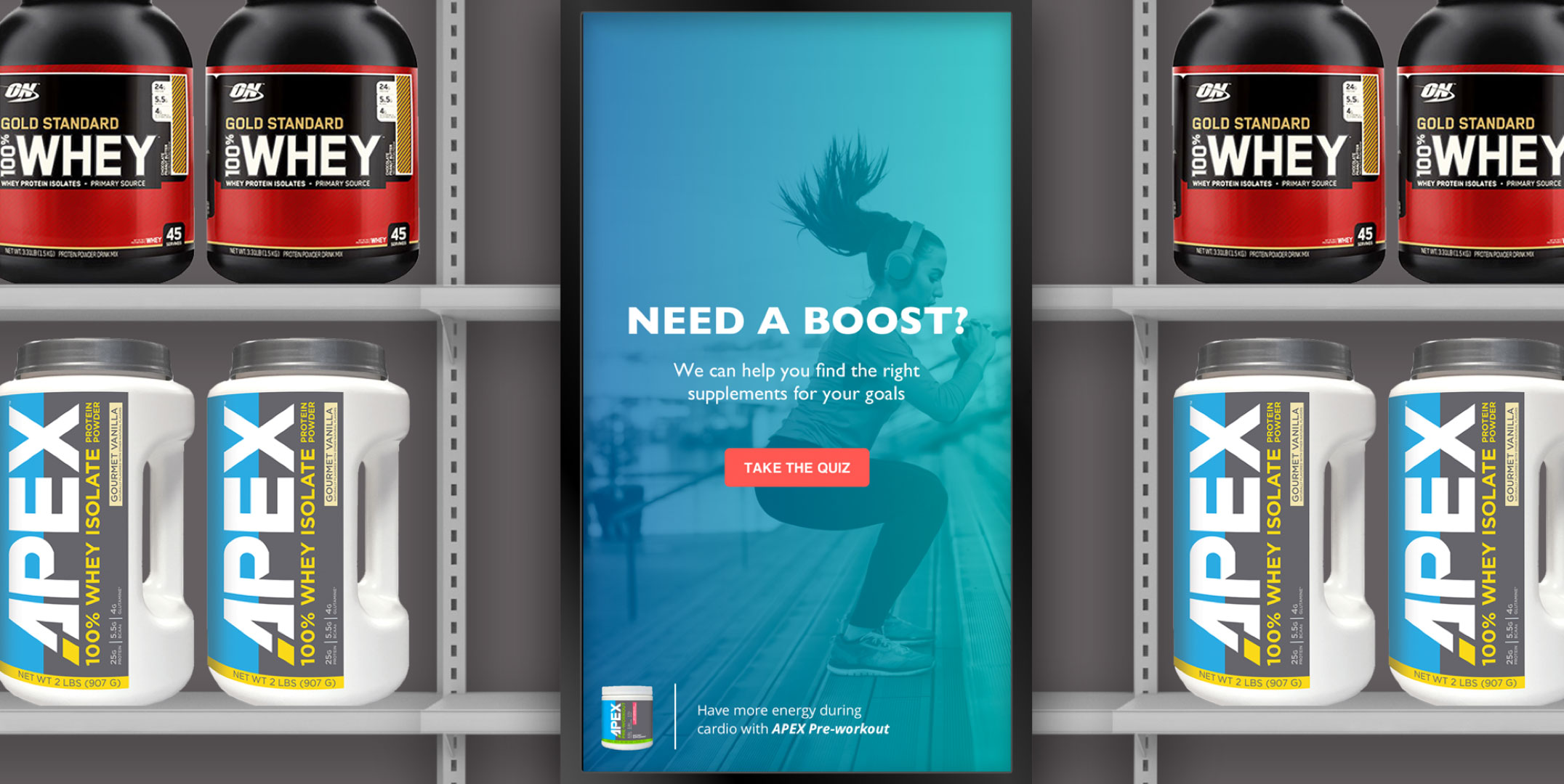
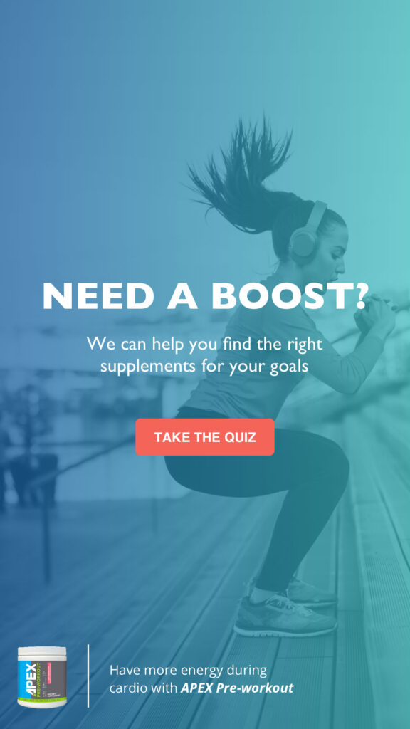
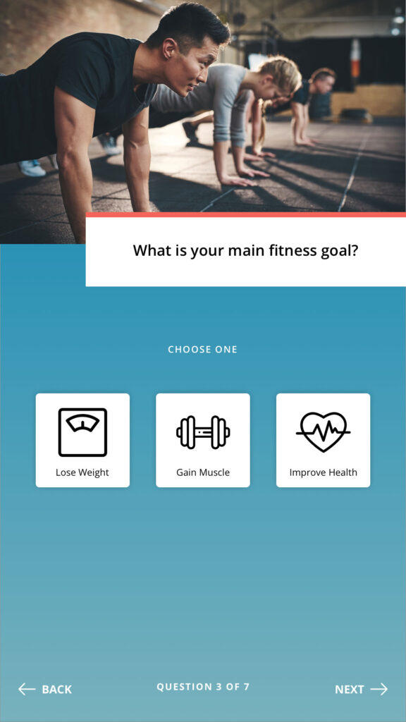
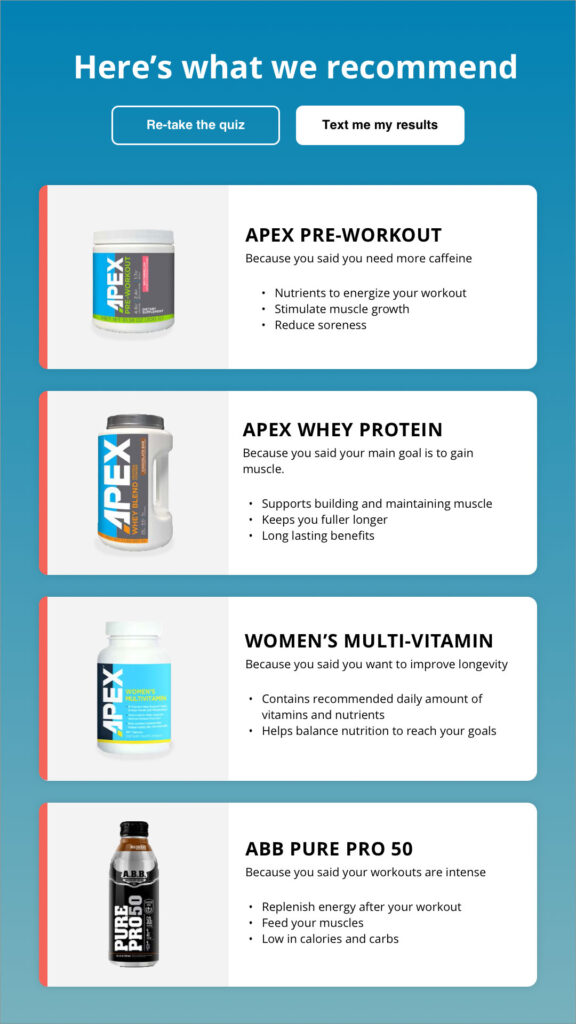
Above are the high fidelity comps showing the attract loop, a quiz question, and the results of the quiz. The splash screen consists of videos to inspire people to be active and has a small section in the bottom left corner that would rotate recommendations for certain customer types. This was intended to give bite-sized detailed information to customers without having to take the quiz. For customers who decide to take the quiz, they answer 7 simple questions and the algorithm recommends the best products for that customer based on their answers. Questions consisted of age, gender, goals, dietary restrictions, and workout intensity.
Once the user gets to their results, they are able to either retake the quiz if they would like to compare products or send the results to their phone to take with them if they are not ready to purchase yet.
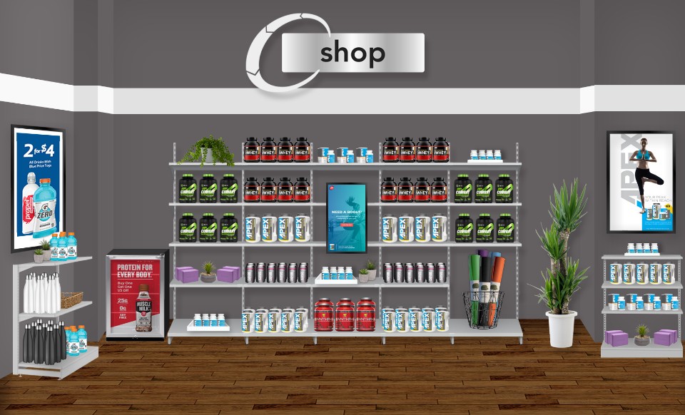
Environmental Mockup
Working with a Visual Designer I handed off the design comps and she was able to then place the screens in an environment that the client would understand. This helped the client to understand the context of the experience and at what point in the journey the end customer/user would encounter this experience. It was the Visual Designer's brilliant idea to place the screen in the midst of the product, where the customer is likely to feel overwhelmed and confused.

