fomopromo App

fomopromo App
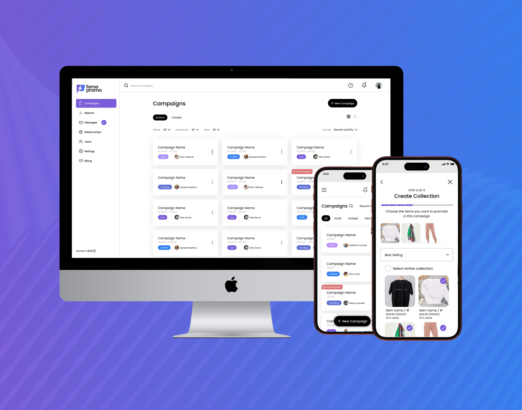
fomopromo is a new sales channel platform built for brands, influencers, and agencies. Brands can collaborate with influencers to multiply their digital footprint globally through cobranded collaboration sites with the influencer. The platform handles all of the details regarding the collaboration from influencer deliverables, to compensation, to deadlines and payments.
The Problem
Before fomopromo, influencer marketing deals between brands and influencers were managed manually, primarily through emails. Brands struggled to track their influencers, monitor deliverable completion, and manage campaigns effectively. Influencers, meanwhile, found it challenging to negotiate terms and stay organized with posting schedules. fomopromo was created to address these issues, providing a streamlined platform that connects the right brands with influencers and simplifies the entire process of managing influencer marketing campaigns.
The Business Constraints
As an early-stage startup with a limited budget and resources, fomopromo relied on careful allocation of investor funds to maximize impact. With the need to move quickly, we couldn’t conduct extensive user research. Instead, we had to be resourceful—drawing insights from desktop research, competitor analysis, and a solid understanding of the influencer marketing space to inform our design decisions. This agile approach allowed us to keep momentum while staying within our constraints.
My Role
As the solo lead designer for fomopromo, an early-stage startup, my role extended far beyond UX and UI design. I led and executed the entire design process, from ideation to high-fidelity implementation, while also spearheading market research, running collaborative workshops, shaping content and marketing strategies, and even handling product tasks like feature prioritization. This multifaceted role allowed me to make a significant impact across the board, helping to shape and drive the vision for fomopromo at every stage of its development.
Project Components
Research
UX Design
UI Design
User Testing
User Research
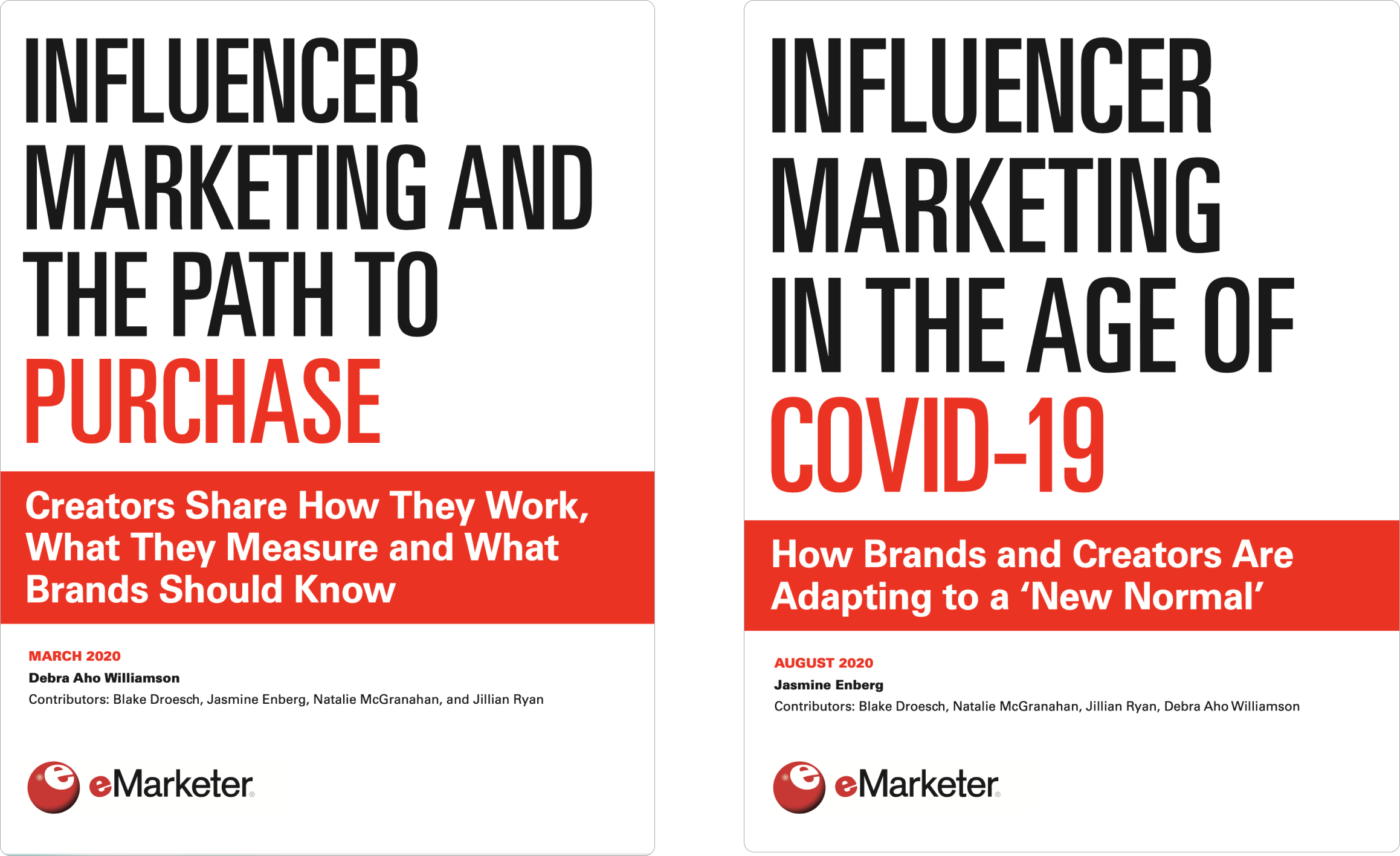
When I joined fomopromo, our team was small—a group of entrepreneurs, developers, and myself as the designer. As an early-stage startup with limited budget and funding, we didn’t have the resources to conduct extensive user research with real potential users. Instead, I conducted extensive desktop research, diving into influencer marketing articles from sources like eMarketer, analyzing potential competitors, and connecting with social media managers and influencers who were open to sharing their insights. This research gave me a solid understanding of influencer marketing, the current processes for brand-influencer collaborations, and the gaps and pain points that our platform could address.
Feature Prioritization
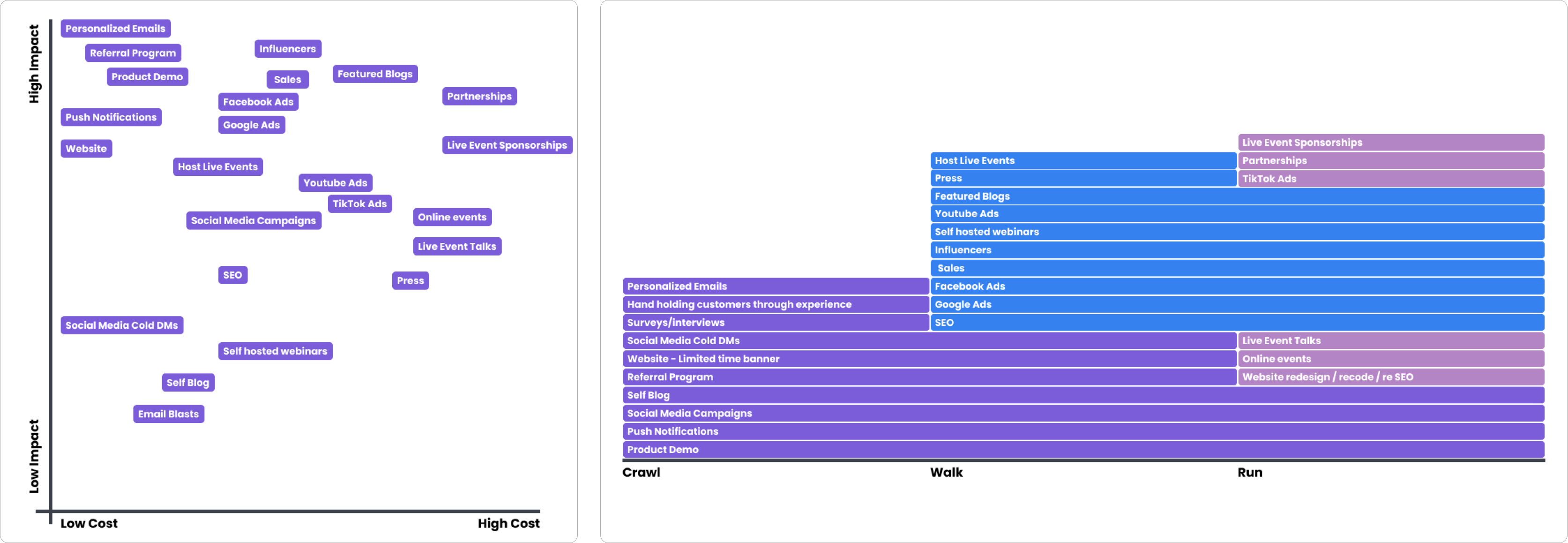
After presenting the results of my desktop research and discussing additional insights gathered by other team members, we held a collaborative brainstorming session to identify features that would set our platform apart and genuinely serve both brand and influencer users. I then conducted a session where we voted on these ideas and plotted them on an impact-versus-cost chart, allowing us to prioritize the feature rollout from the MVP stage onward. This prioritization formed the basis of our internal roadmap and served as a strategic plan to present to potential investors.

Information Architecture
fomopromo evolved into a complex app with a robust feature set designed to serve two distinct user types, each with slightly different experiences. Given that both influencers and influencer marketing managers often work on the go, we needed to optimize the platform for both web and mobile. Once we solidified the feature set, it became essential to map out the information architecture—determining how all components fit together, where users would access them, and organizing the extensive information and interactions that users would engage with on fomopromo.
User Flows
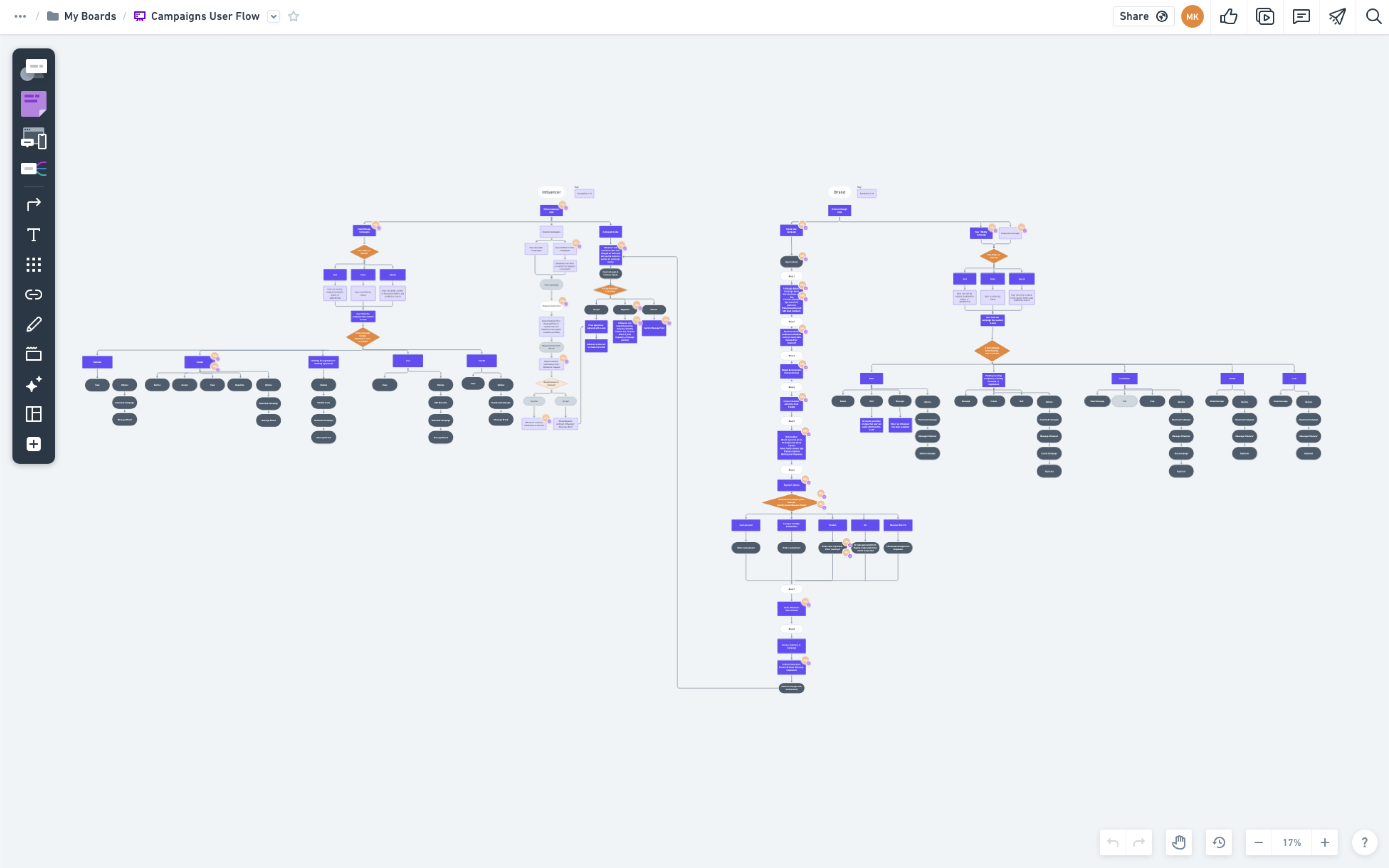
In addition to mapping out the information architecture, it was crucial to analyze the key tasks users would perform on fomopromo and to outline those experiences step-by-step. This was especially important for areas where interactions and data flow converged between the two user types. The image above illustrates a complex flow detailing how a brand creates a campaign, sends it to an influencer, and how the influencer then receives and interacts with that campaign. Since campaigns are the heart of the fomopromo platform, it was essential to understand how data integrates within a campaign and the entire campaign lifecycle as it progresses between brand and influencer users.
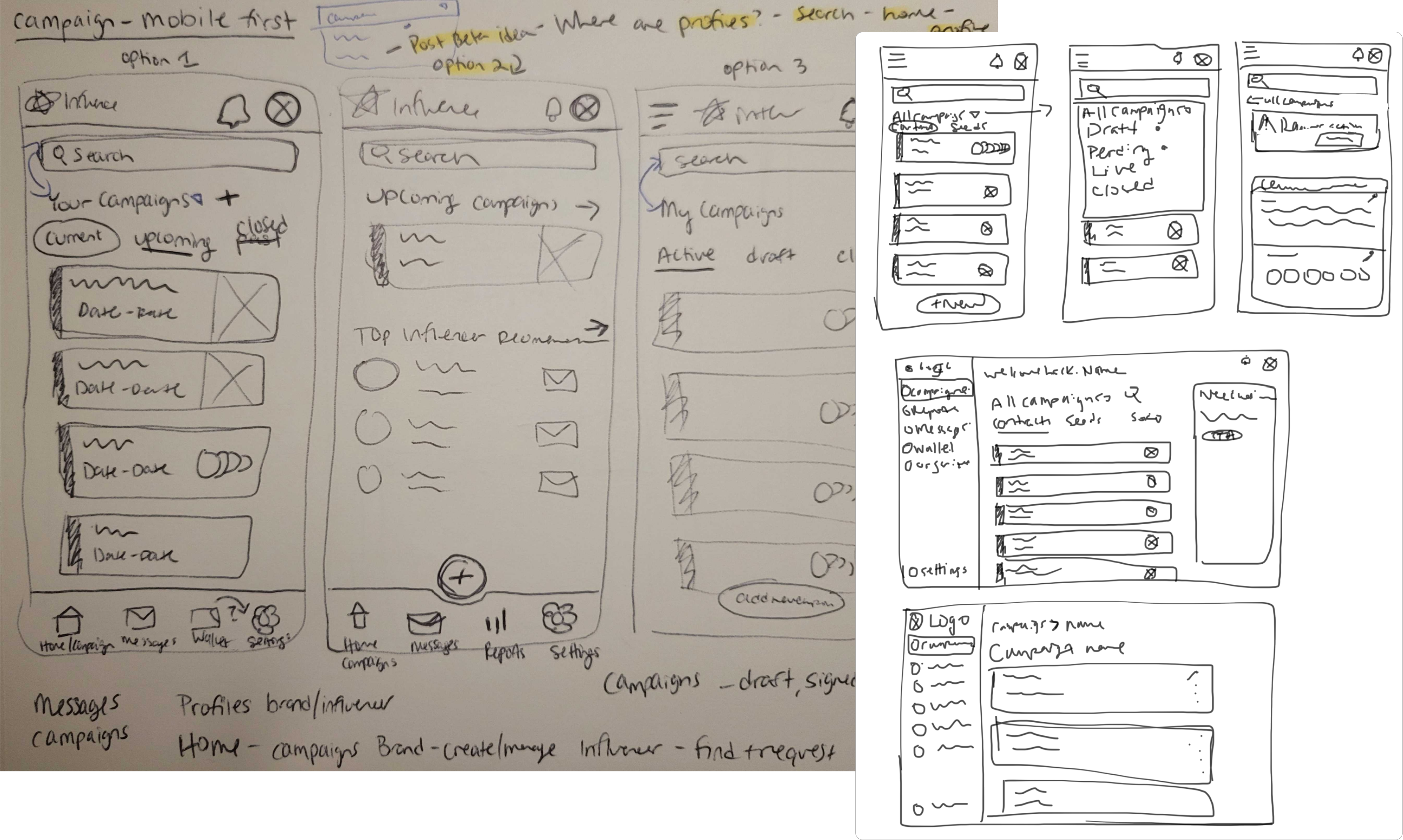
Low Fidelity Wireframes
Given the app's complex interactions and the necessity for mobile accessibility, I approached the design with a mobile-first focus. I iterated through numerous sketches, exploring a range of layouts and ideas to ensure that the design would function smoothly on both mobile and web. This process continued until I landed on a layout that effectively supported the data volume and optimized the user flows across all platforms.
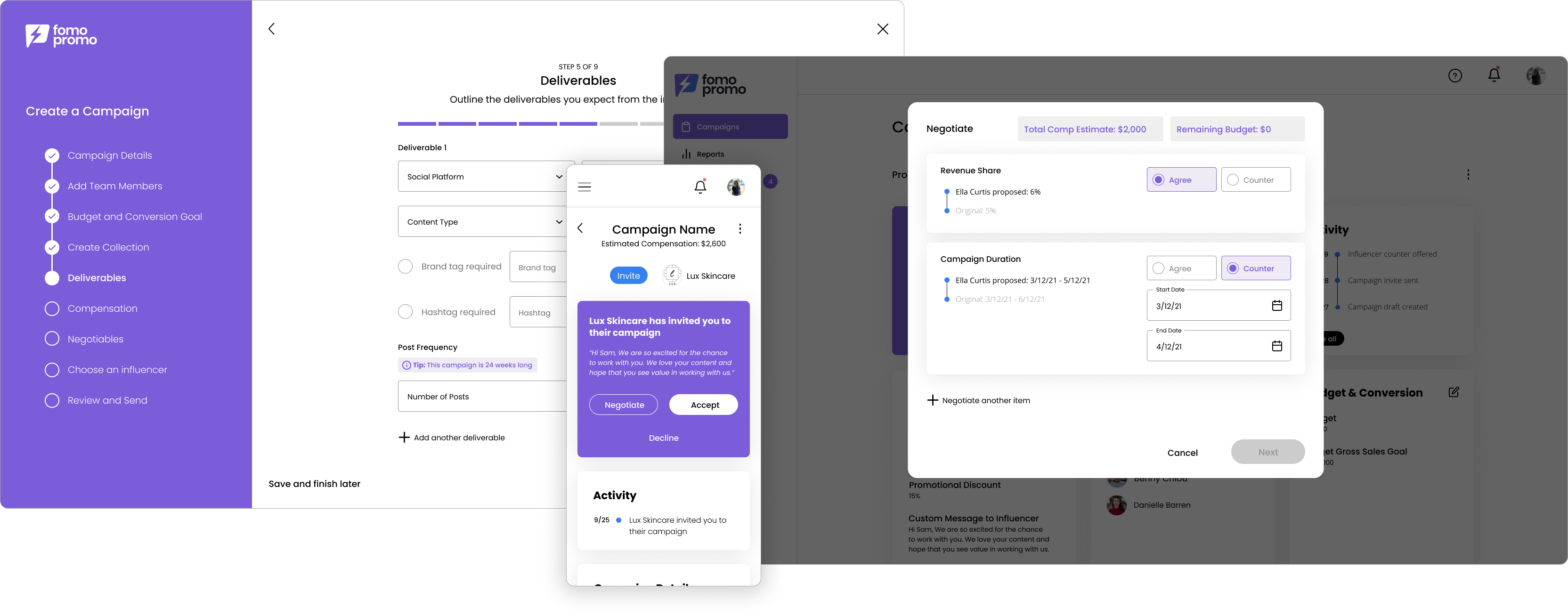
High Fidelity Designs
During the design phase of fomopromo, we collaborated with a brand designer to create the logo and define the brand colors. Together, the team contributed ideas on how best to represent fomopromo’s identity, resulting in the creation of a vibrant, distinctive brand. Building on that foundation, I transformed the low-fidelity sketches into high-fidelity designs, integrating the playful brand colors, carefully selected icons, and typography that complemented and enhanced the brand's aesthetic.
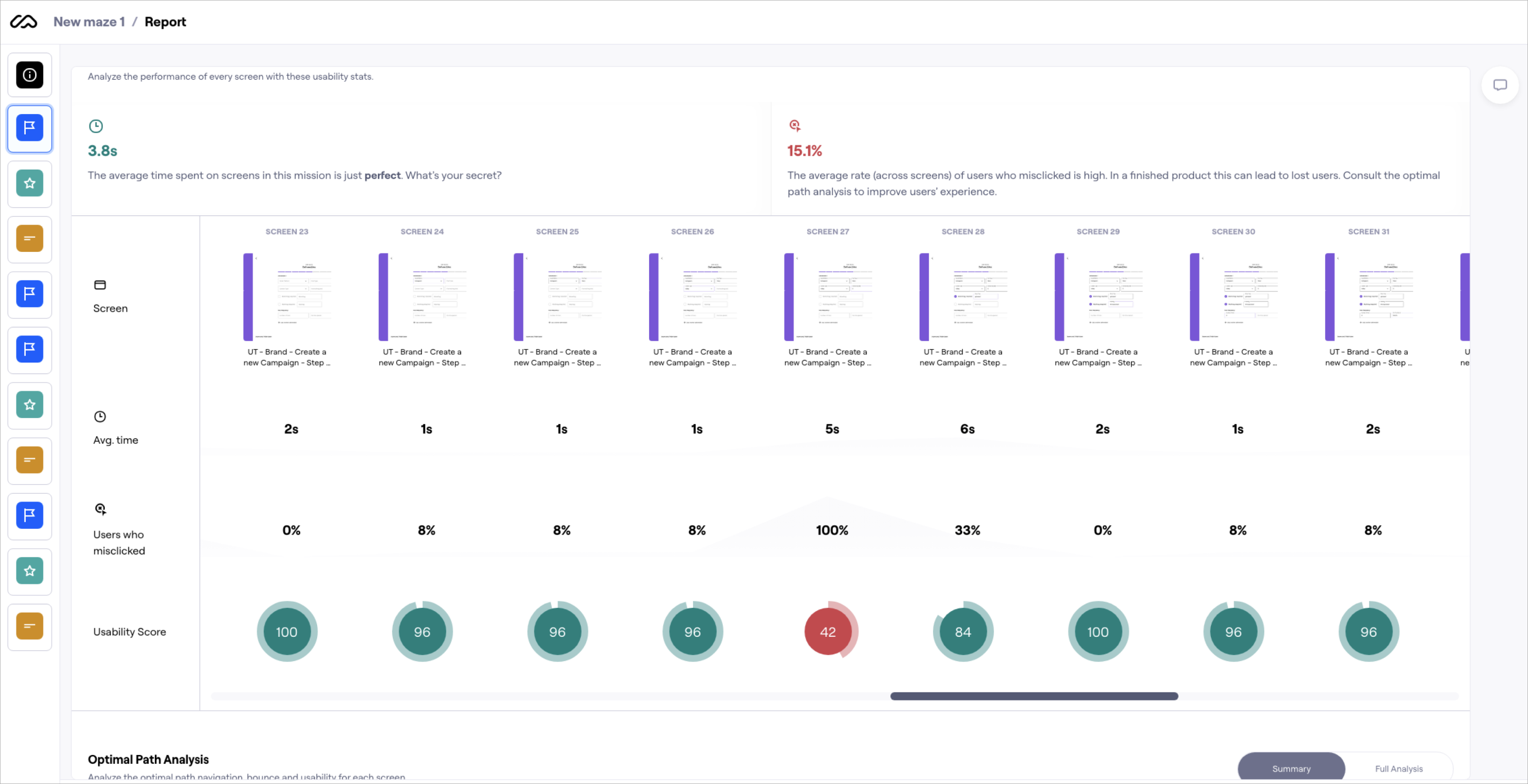
User Testing
Throughout the design process, we conducted several user tests whenever we had the additional budget. Using Maze, I led an unmoderated, remote task-based test in which users interacted with a prototype to simulate creating a campaign and negotiating with an influencer. The feedback was largely positive, with users finding most of the design intuitive and easy to navigate. However, we identified some confusion around the language in the "deliverables" section during campaign creation. Users found certain terms unclear and had difficulty completing this part of the task. We leveraged these insights to revise the page, introducing clearer language and a more streamlined flow for adding deliverables to a campaign.
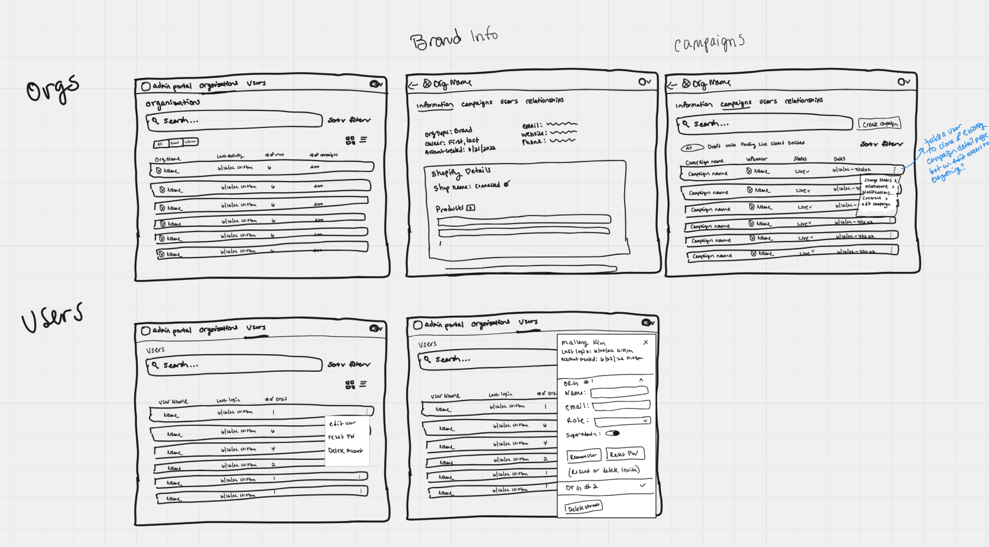
Admin Portal Sketches and Ideation
After the MVP launch of the platform, real user interactions quickly highlighted the need for an administrative portal to manage key support tasks. Previously, whenever users reached out with questions or issues, developers had to dive directly into the database to understand and resolve concerns. By creating an admin portal, we empowered team members to access detailed information about specific brands or influencers and perform essential administrative actions.
When the need for an admin portal became clear, I collaborated closely with the owner and our developers to identify the key issues users were reaching out about and define the core functionalities needed for the portal. Once the requirements were documented, I began sketching and brainstorming different layouts, focusing on how to organize and present the information in an intuitive and accessible way. Throughout this process, I shared my sketches with both the engineering team and the owner, ensuring that they, as primary users of the portal, understood the design and felt confident it would meet their needs. Their feedback was essential to making sure the portal would be both effective and user-friendly for the team.
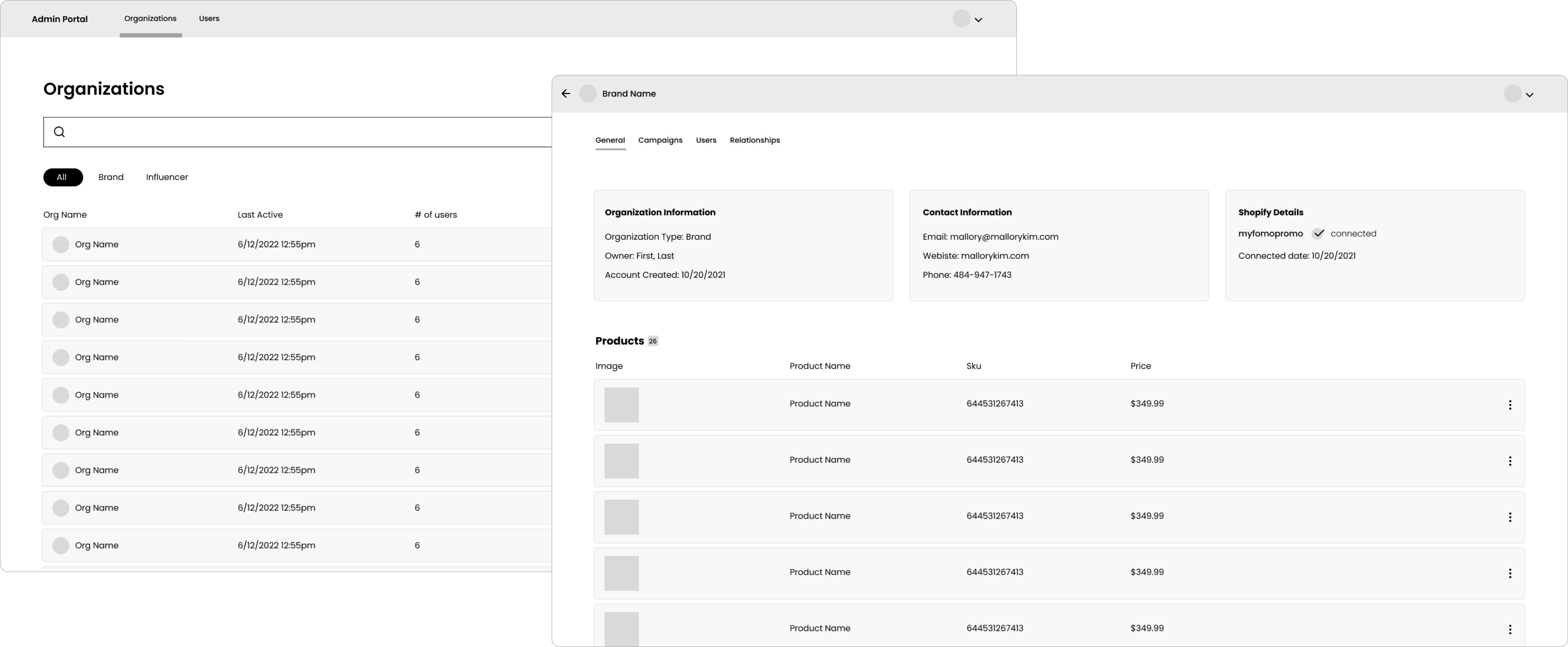
Admin Portal Low-fidelity Wireframes
As I moved from sketches to low-fidelity wireframes, and then to high-fidelity designs, the overall design continued to evolve and refine. A notable area of this evolution can be seen in the detail page for a brand, where we had to display a vast amount of information in a clear and digestible way. Throughout the entire design process, I made sure to involve the engineering team and the owner, sharing updates at every stage to gather their feedback and ensure the design aligned with both the technical capabilities and user needs. This iterative collaboration helped shape a final product that was both functional and intuitive.
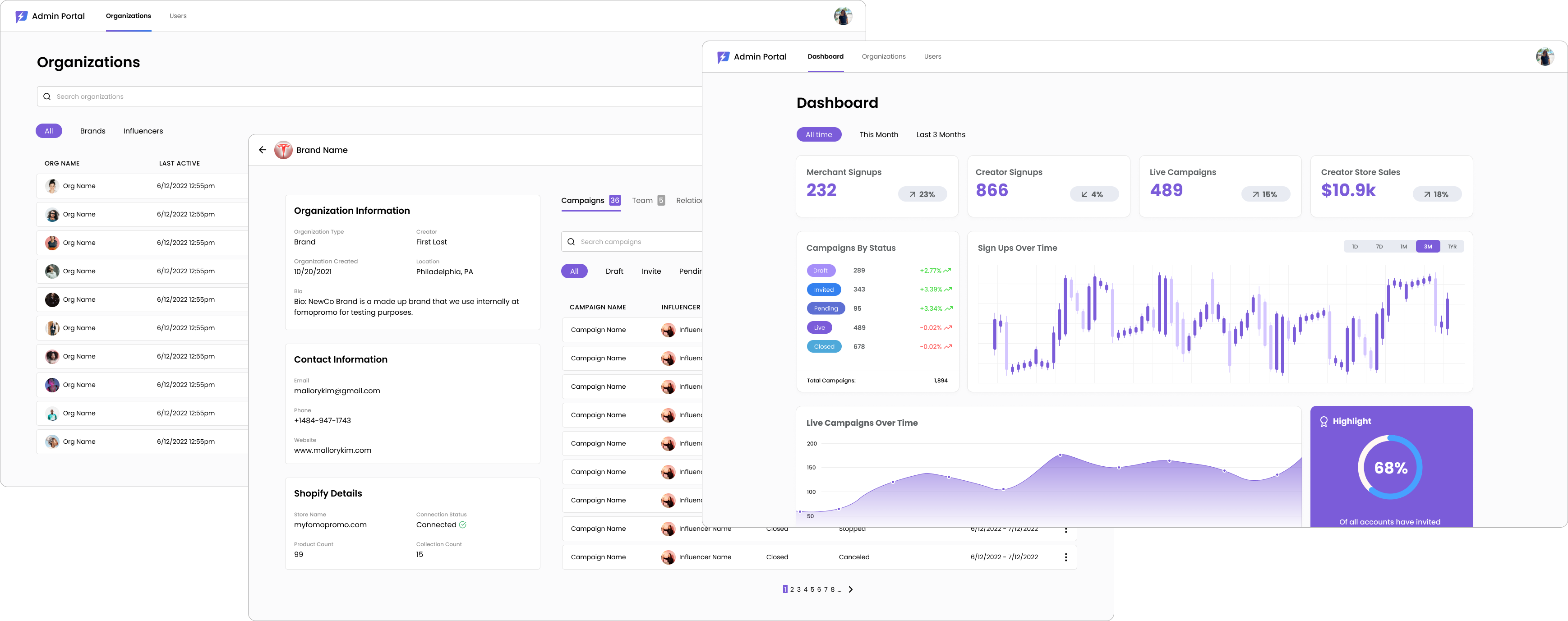
Admin Portal High-fidelity Designs
The high-fidelity designs emerged from earlier ideation, leveraging the app's established branding while keeping the portal’s design streamlined and functional for internal use. By creating this portal, we significantly enhanced our customer support process, boosting response efficiency and empowering any team member to quickly and effectively address user inquiries. The portal has become a crucial tool, transforming how we manage and support our user base.
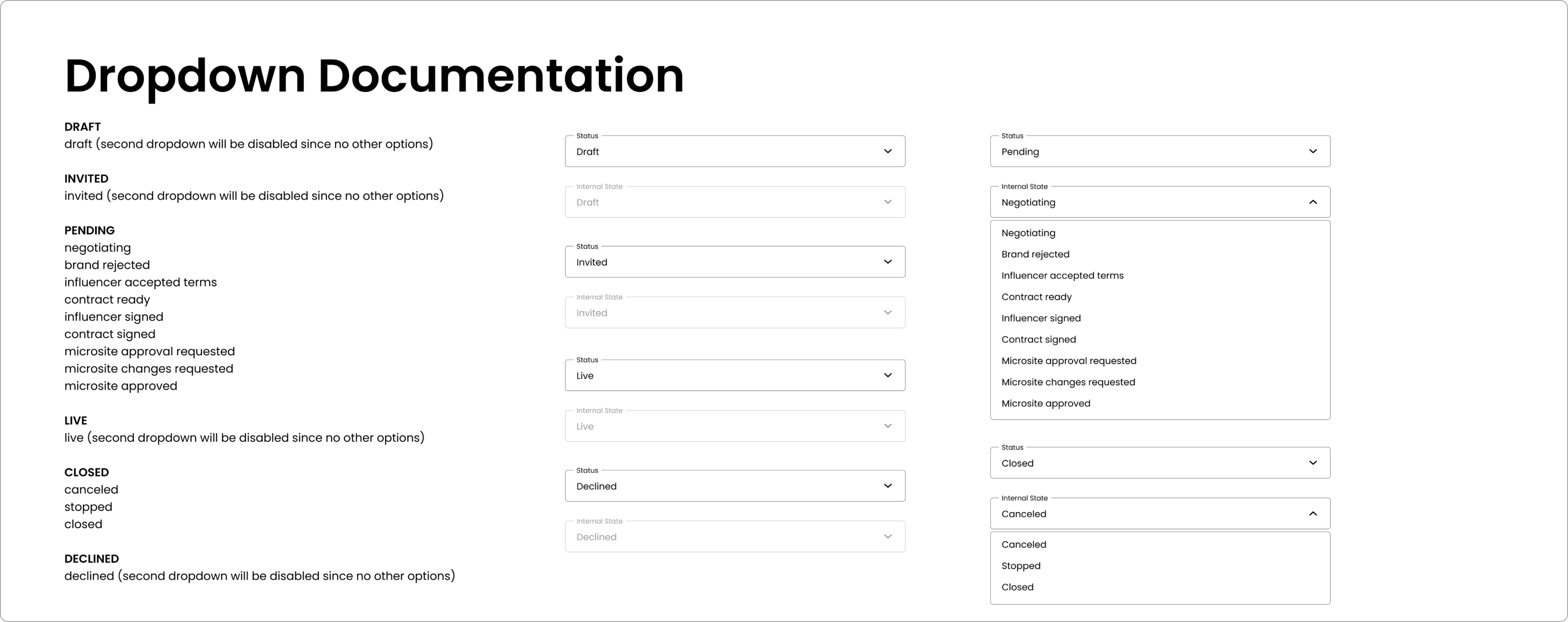
Admin Portal Dev Documentation
In my design process, I document interaction and design details continuously, minimizing misunderstandings and reducing back-and-forth communication with the development team. For elements that didn’t have specific designs, I provided thorough documentation on their functionality—especially dynamic, data-driven components like dropdowns and filters—to ensure clarity and alignment on every aspect of the user experience.

