Grocery of the Future

Grocery of the Future
As grocery delivery and buy online, pickup in-store gain in popularity, there is still a large percentage of customers that prefer to go into the physical store. This experience challenges customer problems head-on and creates a convenient and personalized experience, allowing for customers to utilize product discovery, shopping lists, shop by recipe, and other features they may use online, while still having the satisfaction of being in-store.
The Problem
Online grocery services are growing rapidly, creating an effect on brick and mortar grocery stores. It is clear that customers still prefer to go into the store, but they face many problems while shopping. Some of these problems include lack of accurate pricing, limited availability of products and coupons, lack of personalization and the exhaustion of walking up and down every aisle to find the product you are looking for. This experience aims to bridge the gap between the convenience of shopping online, and the satisfaction of shopping in-store.
The Business Constraints
Every year my company attends NRF, retail’s largest tradeshow. As part of innovation within the company, we prepare solutions every year to wow the visitors at the tradeshow. Because of the context of this experience being inside a tradeshow, versus an actual store, part of the design process had to focus both on end customers and booth visitors. Perhaps the most challenging business constraint was that this experience needed to be designed for 86″ portrait touch screens.
My Role
Working with an entire team of innovators, my role specifically was to lead all UX and UI efforts as part of this project. I worked with a researcher to understand the core problem and develop personas, and then ideated with the entire team on what this experience would look like. After ideation, all UX and UI tasks were left to me, including prototypes, developer collaboration, and testing (both QA and Usability).
Project Components
User Research
UX Design
UI Design
User Testing

Up-front Research
In our research findings, the biggest data point that stuck out to us was that 59% of online shoppers make an in-store trip to complete their list. So why is that?
Key Insights from our Research
The main reasons customers go into the store is:
- To pick out their own produce and perishables
- Product discovery: online shopping has made it too easy to purchase those items on your regular list that it leaves no room for discovering new products.
- To get the items right away. Not all locations have 1-hour or 1-day delivery.
Personas
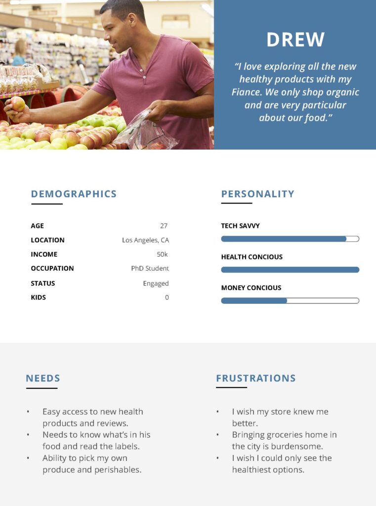
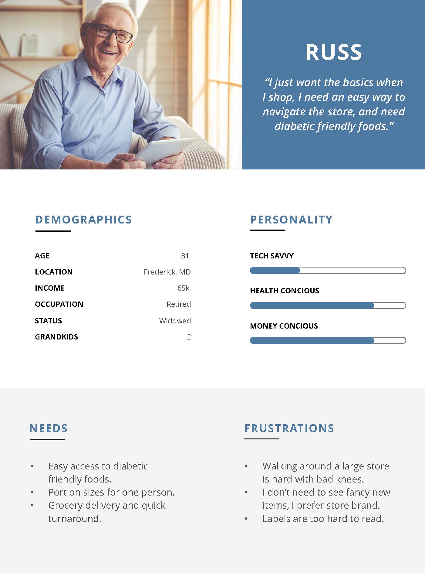
With this research, we created 3 personas to serve as our north star while designing this experience. Between these three personas, their biggest differentiating factor was their household size and who they are shopping for, because this drastically changes the way people shop.
Another very important factor is their needs and frustrations. Some prefer to pick out their perishables, while others love to browse the newest and greatest health products.
It's important to know that there is also a fourth persona in the mix: the retailer. We considered this as well through our design process.
Site Map
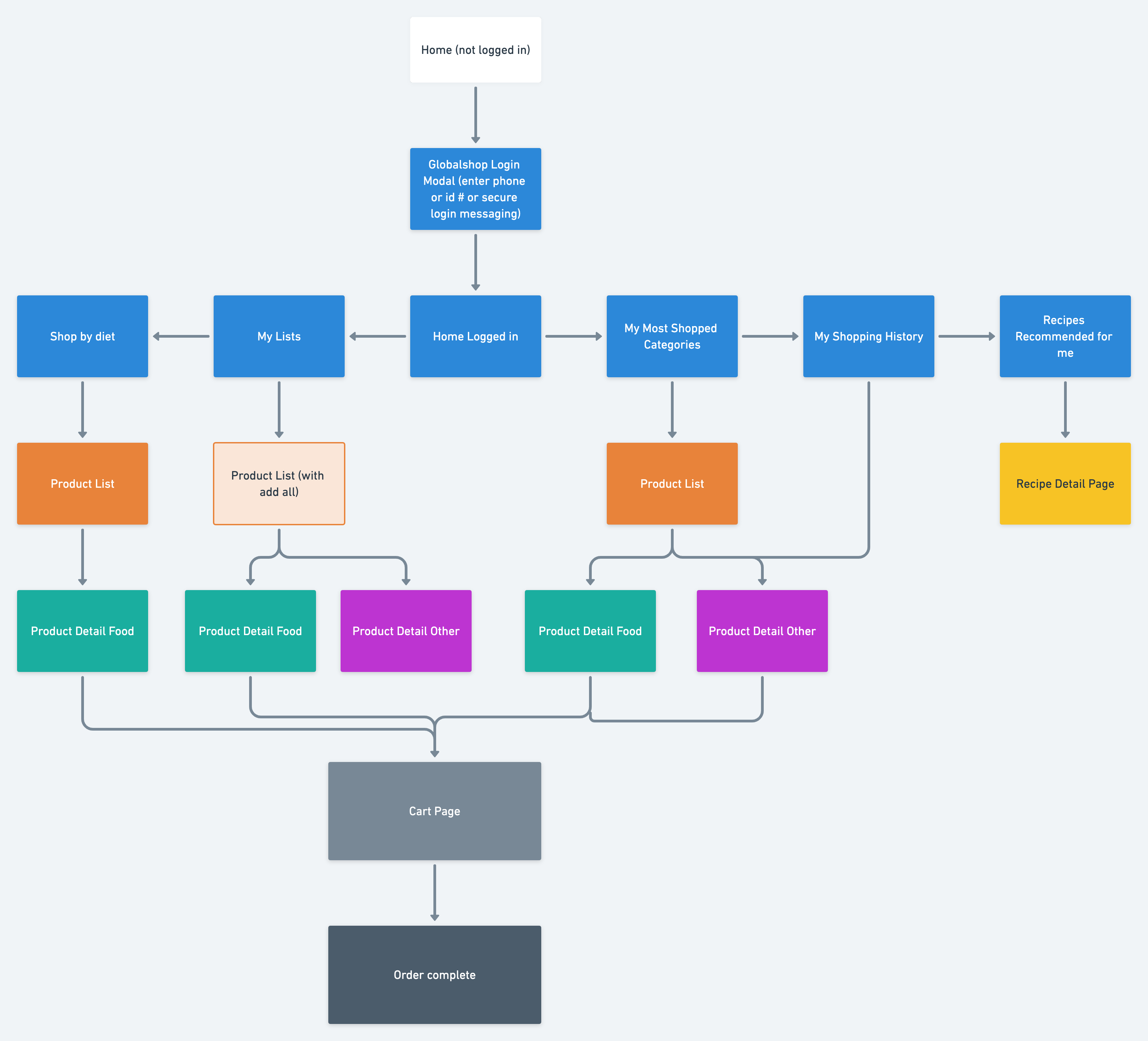
I created a site map to get a basic understanding of the features we will have in this solution, along with a high-level explanation of what each will entail. This helped both myself and the development team to plan for the finer details that came later.
User Flows
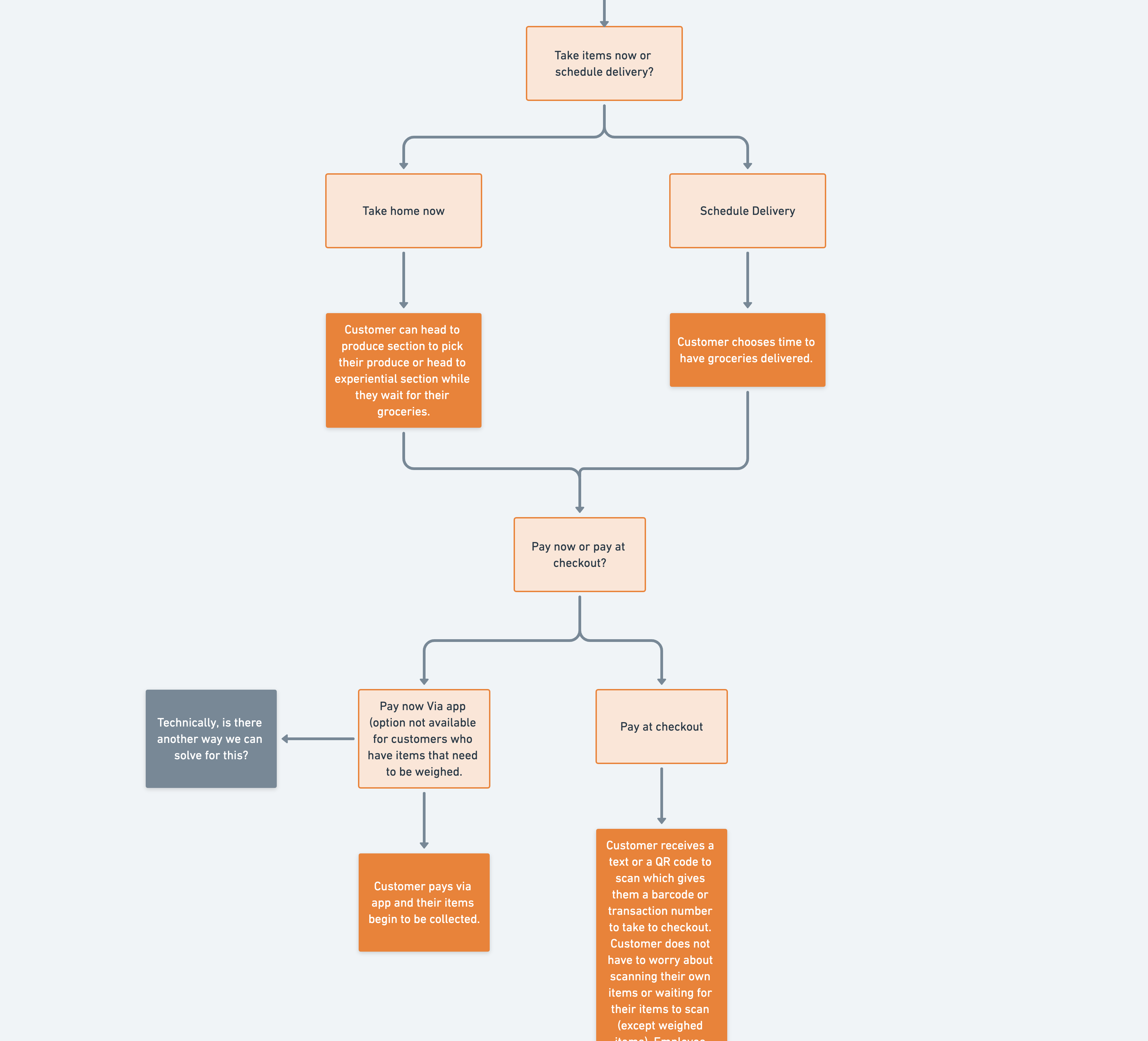
Because this experience takes place in the open environment of a grocery store on an 86" touch screen, it was important to be able to maintain the user's privacy. Because of this, much of the experience could be transferred to the user's phone for things like checking out, shipping, and shopping preferences.
It was important to be able to outline the details of what happens on each screen, both from a UX perspective and also for the development team.
Lo-fi Ideation
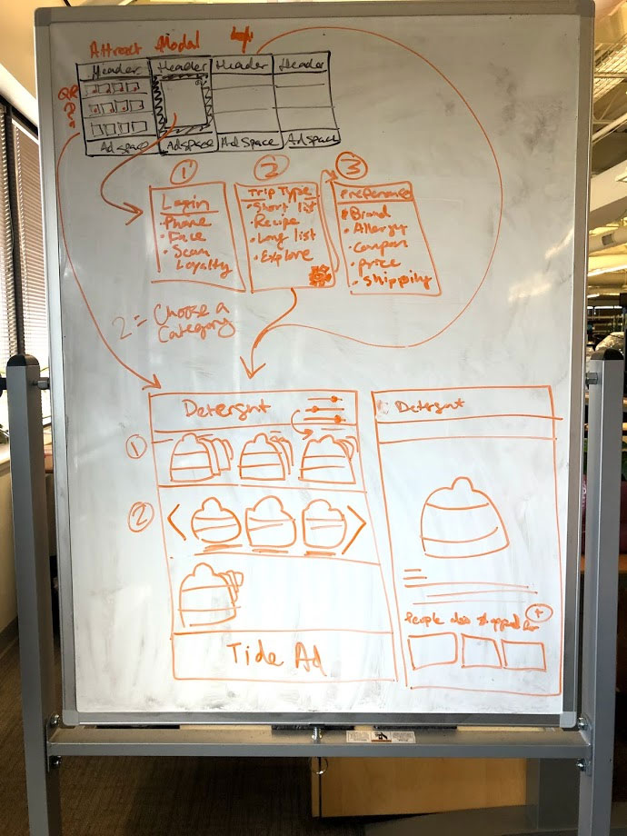
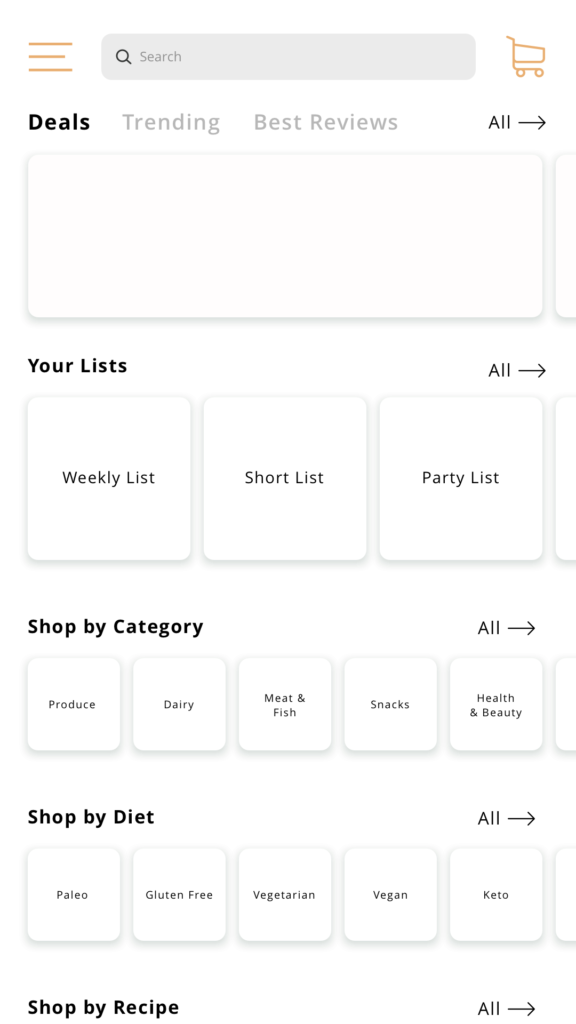
As this is a very complex solution targeting many types of personas and requiring many features, I started with a whiteboarding exercise to validate ideas and rapidly iterate on the best way to represent all the features in the UI. Once the team agreed on a direction, I then moved to low fidelity wireframes, which I used to validate feasibility with the stakeholders and developers before moving onto the high fidelity designs.
Hi-fi Design and Prototyping
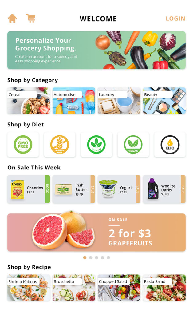
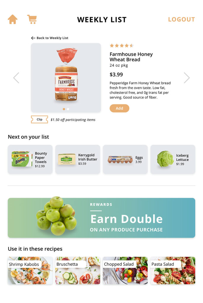
After completing lo-fi wires for the most important screens, I started building out all of the screens in high fidelity. I had to fail fast and iterate as it was important to test the scale and size and reach of this experience as I designed it. Once the complete UI was done, I prototyped it in Marvel and handed it over to development to collaborate on implementation.
QA Testing
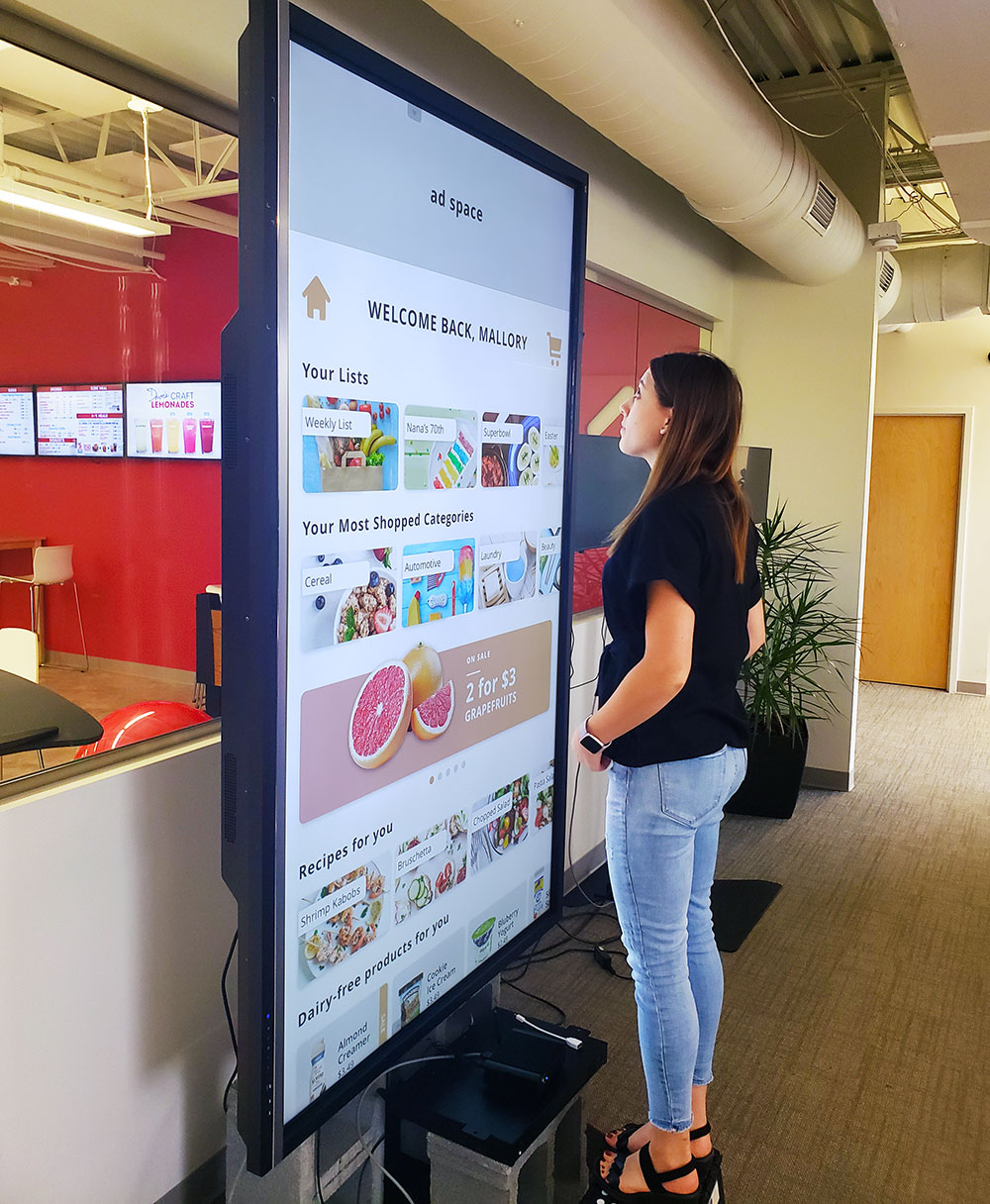
Due to the enormous size of this touch screen, many things had to be considered when designing, such as space up top and below that are not reachable, as well as accessibility. To solve this, we made sure that the content at the bottom of the screen could be completely scrolled up to eye level. We also created ad space at the top that would change based on the content you were browsing. For example, if you were shopping for cereal, you would see an ad up top for almond milk.
This is a picture of me testing scale and reach. You can see me standing on a stool, this stool was purchased at a specific size to simulate exactly the height at which I would be viewing it once it was mounted at the tradeshow. It was absolutely imperative to test with this actual size screen as the original design I made had components that were far too large and needed to be adjusted.
Usability Testing
Unfortunately due to the nature of quick turn around times for tradeshows, we did not have the resources or time to do usability testing before the tradeshow. However, throughout the design of this experience I had a hypothesis around the overall context of this solution and the potential for it to be intimidating to users based on this size. We also gained a lot of feedback around this subject at the tradeshow, which lead me to perform usability testing so that we can consistently iterate on this experience not only for tradeshows but as a solution we offer to clients.
Testing Audience
8 participants, male and female aged 26 and above. A diverse set of users that do both in-store and online grocery shopping.
Type of Testing
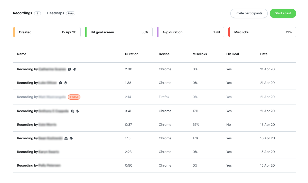
I performed both remote moderated and remote unmoderated using Marvel's new user testing feature.
Major Insights
- 50% of participants clicked on "pickup" in the checkout even though it was already pre-selected.
- 38% of participants did not use the "add all" button to add all items from a list to their cart.
- 100% of participants could not figure out how to select one item for pickup and the rest for delivery on the first try.
- 63% of participants found it difficult to locate and activate the coupons, while 38% could not find coupons at all and abandoned the task.
Areas for Improvement
- Change the pickup/delivery toggle to a UI element that is not pre-selected, forcing the user to make a conscious choice on the one they want.
- Make the "add all" button more prominent.
- The checkout flow, specific to delivery and subscription selections, needed to be re-evaluated as all of the participants could not figure out how to select some items for delivery and some for pickup within the same transaction.
- Coupons should be auto-applied when available, rather than forcing the user to apply them per item.
Post-test Survey
At the end of the usability test, each user was sent a 5 question survey that was specific to the experience, including the context of where it sits in a grocery store, the size of the screen, and how this type of shopping may or may not improve the grocery shopping experience for that user.
Major Insights
- 78% of participants said they would not use this experience.
- 44% of participants said this experience would save them time, 33% said it would save them time if a few changes were made, and 22% said it would not save them any time.
Areas for Improvement
- Consider a different display size that does not take up an entire shelving unit and is less overwhelming.
- Utilize this solution in a new context that could be solving shoppers' problems.
"An 86-inch screen doesn't make sense to me, it's too large. I don't want everyone to see what I'm buying."
User Interviews
The usability testing revealed that the solution created was not really solving customer problems while shopping. I decided to go a step further and do user interviews. I crafted questions that took a deep dive into people's grocery shopping patterns, habits, and pain points for both in-store and online, to try and uncover ways to improve their experiences.
Major Insights
- 93% of participants prefer to shop in-store
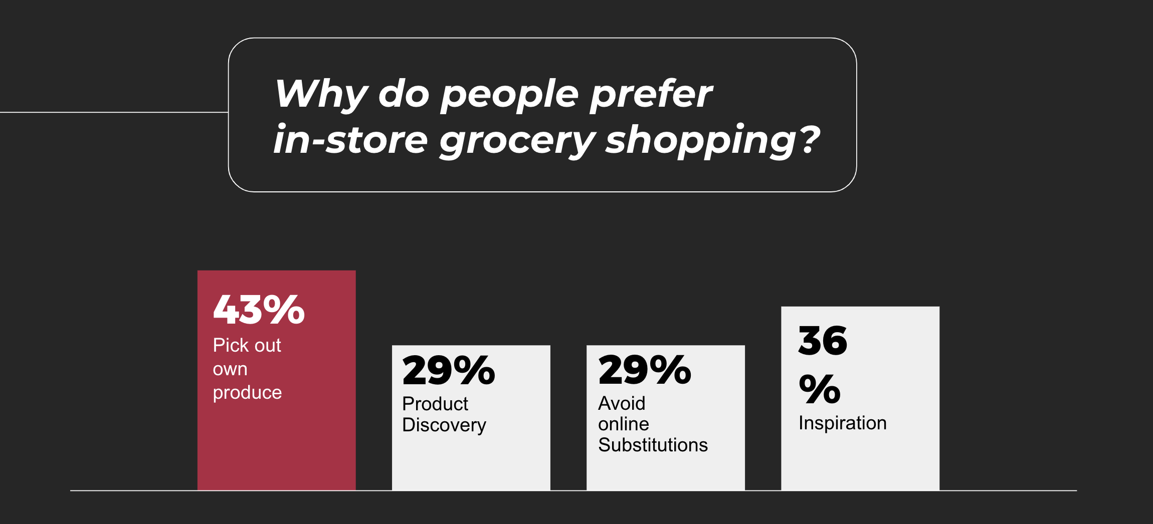
- 43% of participants stated that picking out their own produce is one of the reasons why they prefer to shop in-store. 29% stated product discovery as one of their reasons, and another 29% stated they shop in-store in order to avoid online substitutions.
- Despite "picking out my own produce" being the main reason people prefer to shop in-store, 0% of Millennials stated this as a reason for preferring shopping in-store.
- 64% of participants buy more than they originally planned to buy when grocery shopping in-store, compared to 8% who buy more than planned when grocery shopping online. This directly supports the assumption that in-store shopping is better for product discovery and impulse purchases.
- 50% of participants stated that the most frustrating part of grocery shopping is that it's too time-consuming, the other 50% stated that it's too hard to find what they are looking for.
- 81% of online grocery shoppers said they can recall a time when they received the wrong item, quantity, or quality of a product
What This Tells Us
In-store is still the preferred method for grocery shopping because of product discovery, inspiration, and the ability to pick out your own produce. But in-store shoppers still face many issues, like the inability to easily find what they are looking for, making the trip too time-consuming.
This solution could be shifted to focus on solving the issue of finding products. Perhaps a wayfinding kiosk at every aisle, or an app that curates a path for the user throughout the store based on the list they put together on their phone. Adding more personalization can also help to filter out the items the shopper doesn't want to or need to see.
"Not knowing exactly where products are and searching and having to ask is one of the most frustrating parts about in-store grocery shopping."
Video Demo
Here is a video demo that my company published publicly that outlines the features and value of this experience.

