Practice Space

Practice Space
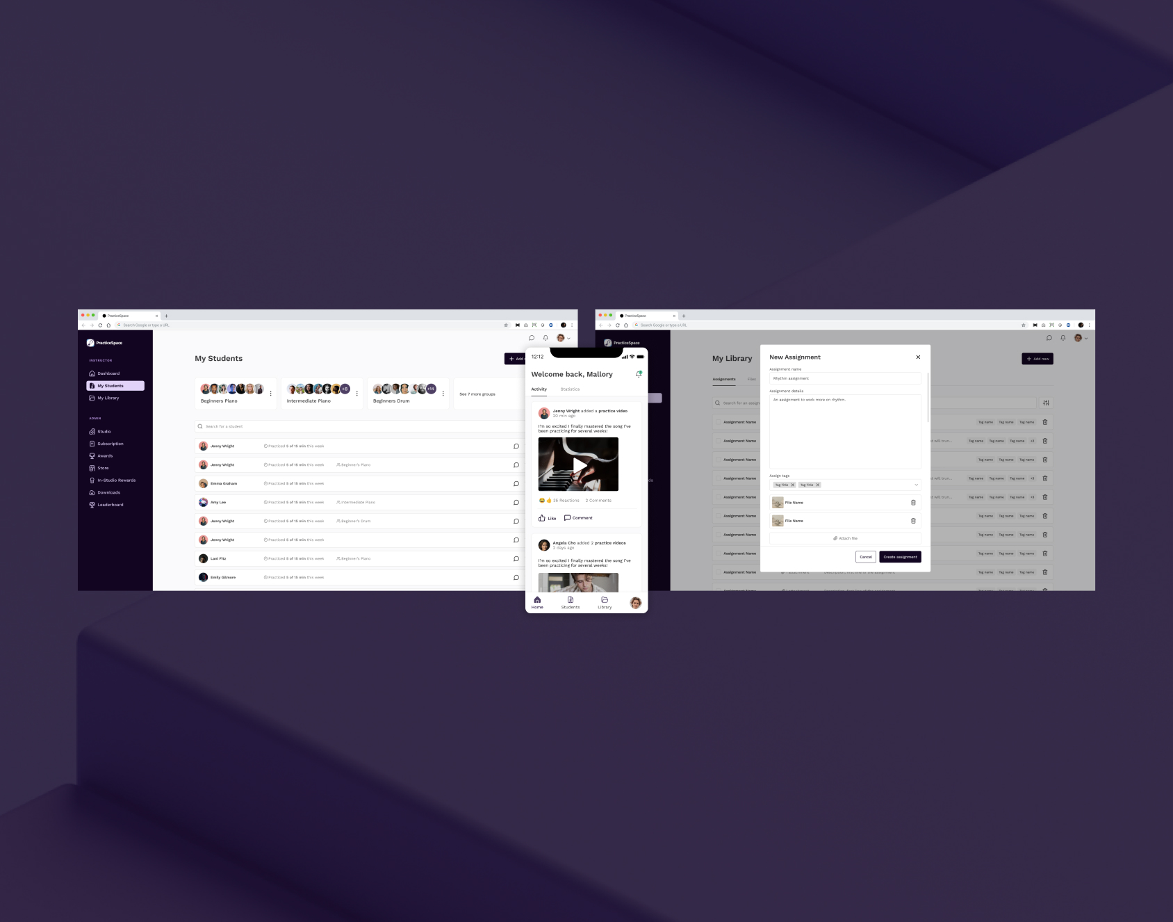
Practice Space is a platform designed to facilitate teaching, communication, and interaction between instrumental instructors and their students. It includes two apps: one for instructors and one for students. This project highlights the design work created specifically for the instructor app.
The Problem
When Practice Space first launched, they had no dedicated designers and relied entirely on engineers to create the interface as they coded. Recognizing that the interface was dated and needed visual updates and usability enhancements, I was brought onto the team to take on this exciting challenge.
The Business Constraints
Although the team recognized the importance of investing in strong design, they already had an established product with a loyal user base. As a result, they wanted to avoid a complete UI overhaul and instead focus on subtle stylistic updates to improve visual appeal and usability. This presented an exciting challenge in finding solutions that would enhance the interface without requiring extensive development work or disrupting the experience for existing users.
My Role
In my role as the lead UX designer for this project, I worked hands-on as the sole designer, partnering closely with the owners and the front-end engineer to shape the refreshed look and feel of Practice Space. Together, we refined design elements, aligning them with the team’s vision and user needs to create an updated, cohesive interface that would become the new face of the platform.
Project Components
User Research
UX Design
UI Design

Current Designs
This project was referred to me by a developer I had collaborated with on prior client work. The company was looking to invest in improved UI design, focusing on small, incremental enhancements. When I joined the team, I first took the time to understand the platform’s functionality for both students and instructors, analyzing what was effective and identifying areas for improvement. Collaborating with the developer, we created a plan that balanced the scope of UI changes with available resources and the release schedule. From there, I began ideating on what the refreshed look for Practice Space could be.
User Research
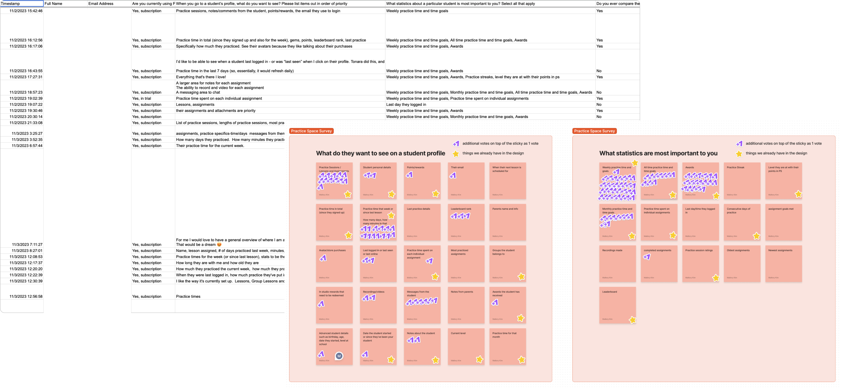
As I began developing new design ideas, I documented key questions for users, such as which data points were most important to them and what they would expect to find on a student profile. Collaborating with the owner, I crafted a set of survey questions aimed at real users of the app. After he distributed the survey and shared the raw results with me, I carefully analyzed the feedback to identify what our instructor users needed most. These insights became the foundation for creating designs that best aligned with user expectations and preferences.
Inspiration
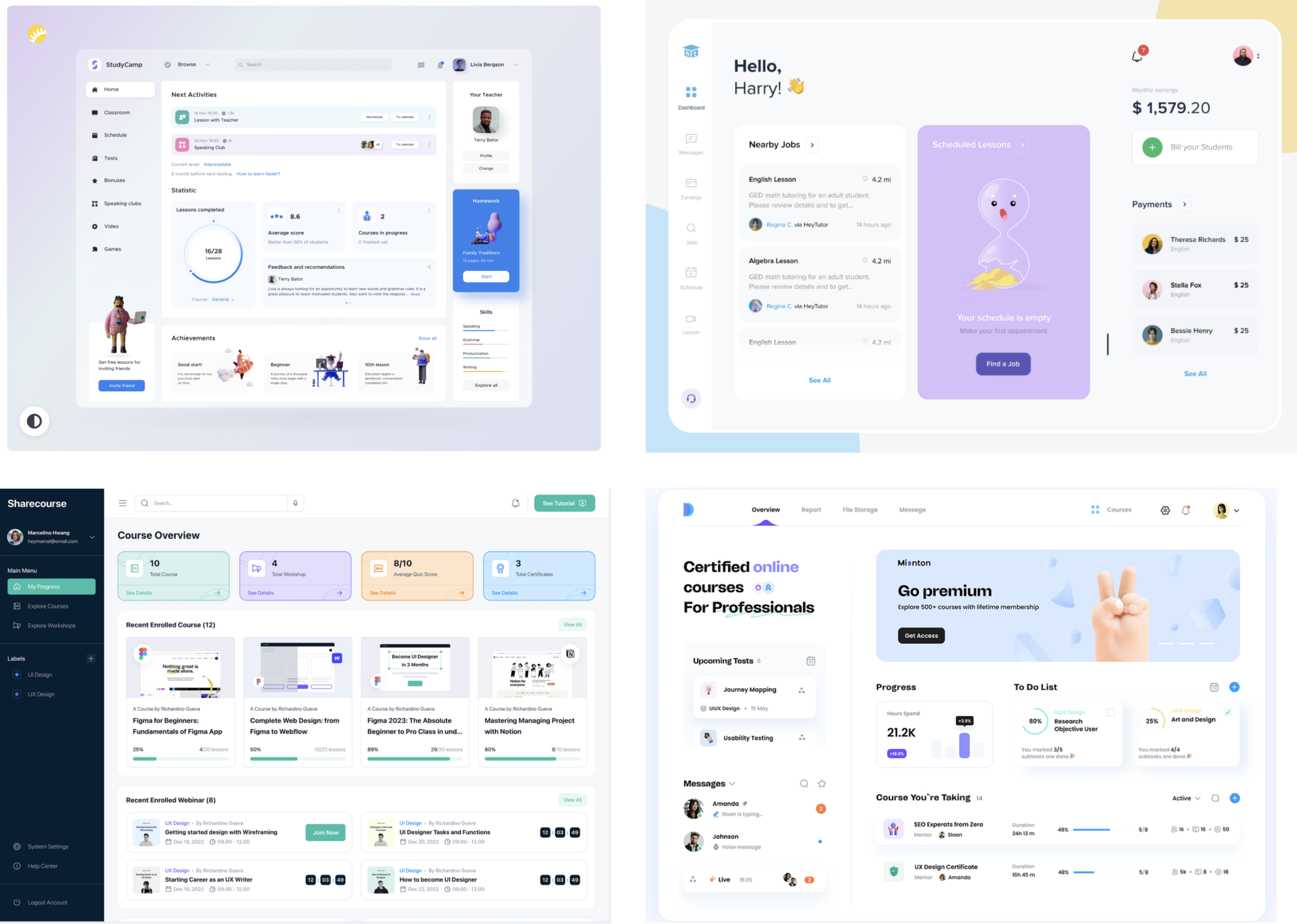
Working with this client allowed me to gain a deep understanding of their app expectations during the discovery phase. Before starting wireframes, I aimed to clarify the visual style they envisioned, as there were several potential directions we could take. Given the client’s preference for a focused approach due to budget and time constraints, we prioritized a streamlined design with essential updates.
Low-fidelity Sketches
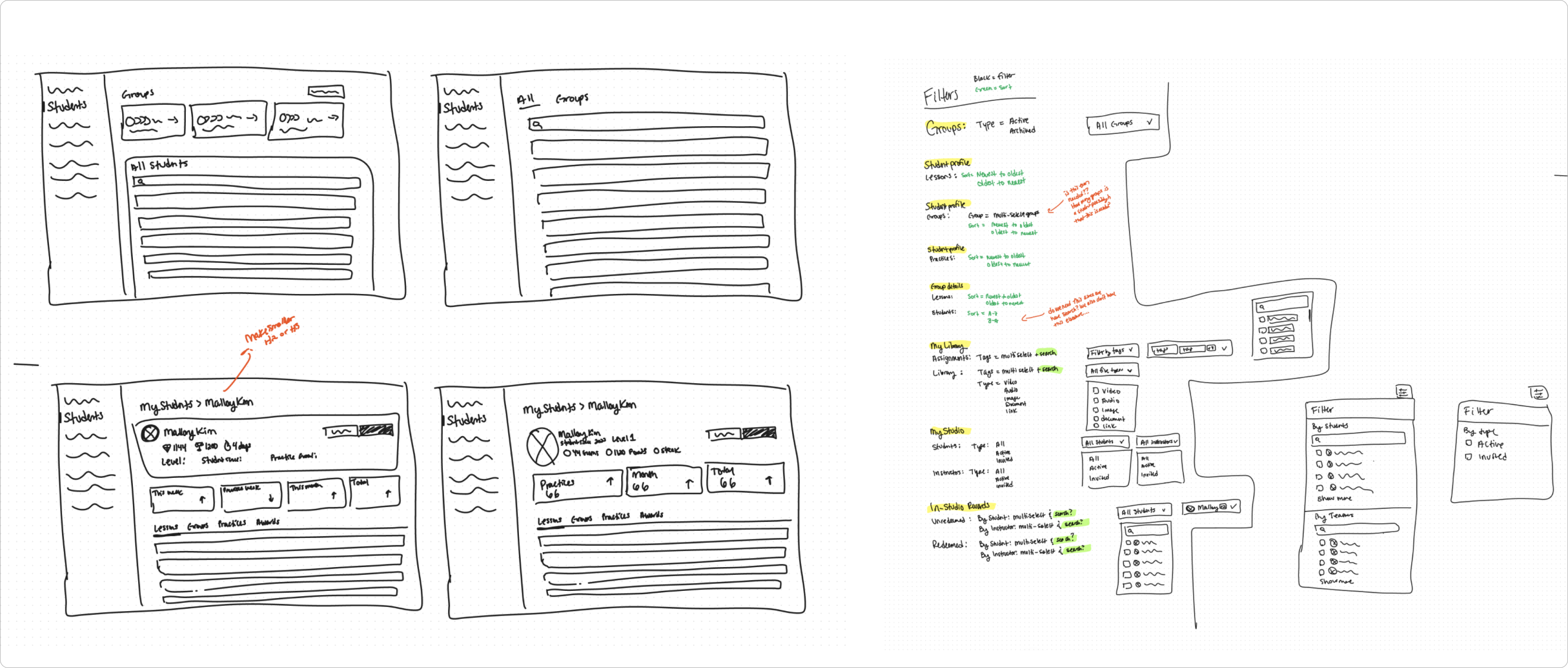
After familiarizing myself with the app and understanding both the data connections and the key tasks users needed to complete, I began sketching layout ideas for the new design. My goal was to enhance usability and visual design without completely rearchitecting the interface. One of the biggest challenges was incorporating filter and sort options—features that were missing in the previous version but crucial due to the volume of data involved. The image above shows my ideation process for integrating these sort and filter options effectively.
High-fidelity Designs
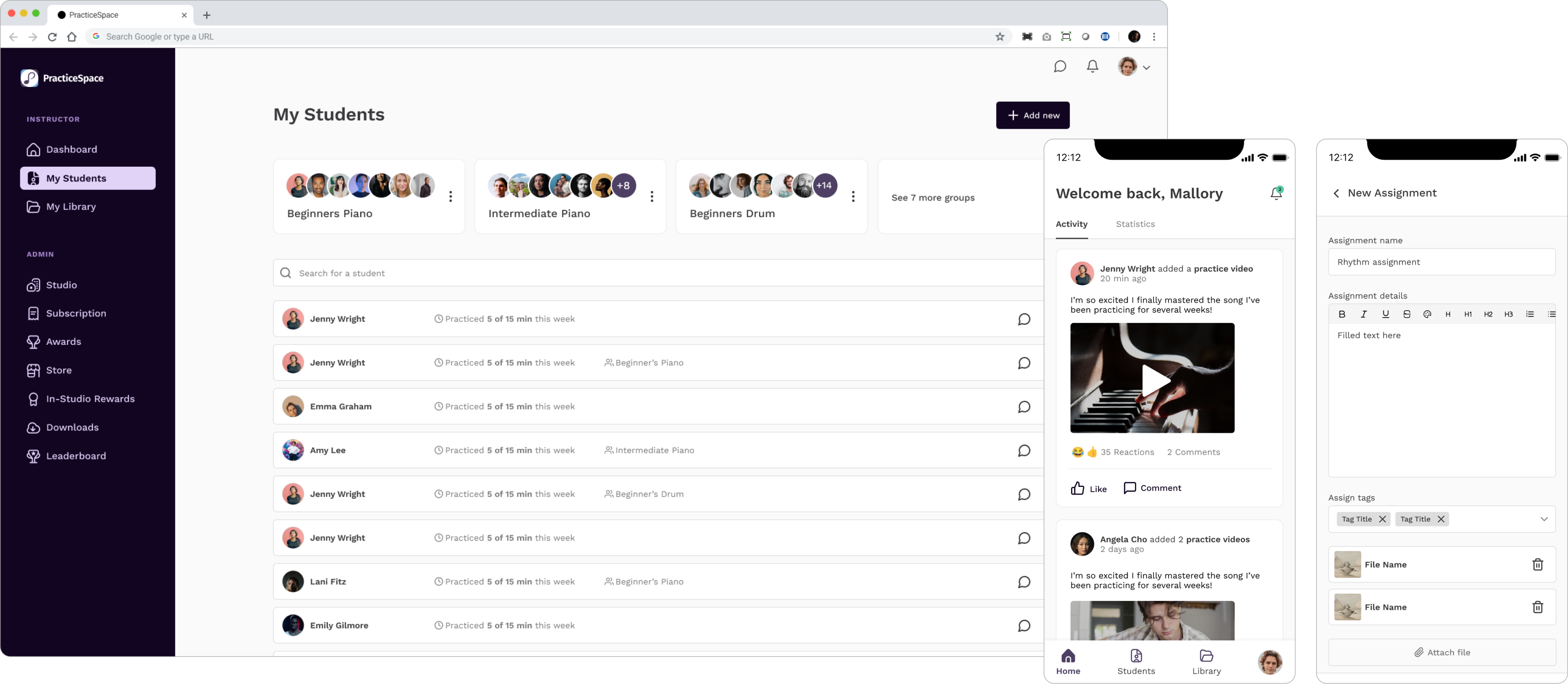
This is where all the detailed work from the discovery and ideation phases comes together to create an exceptional product. Building on the wireframes and visual inspiration—and collaborating closely with the developer and the owner—we arrived at the finalized designs for web and mobile.
Developer Spec
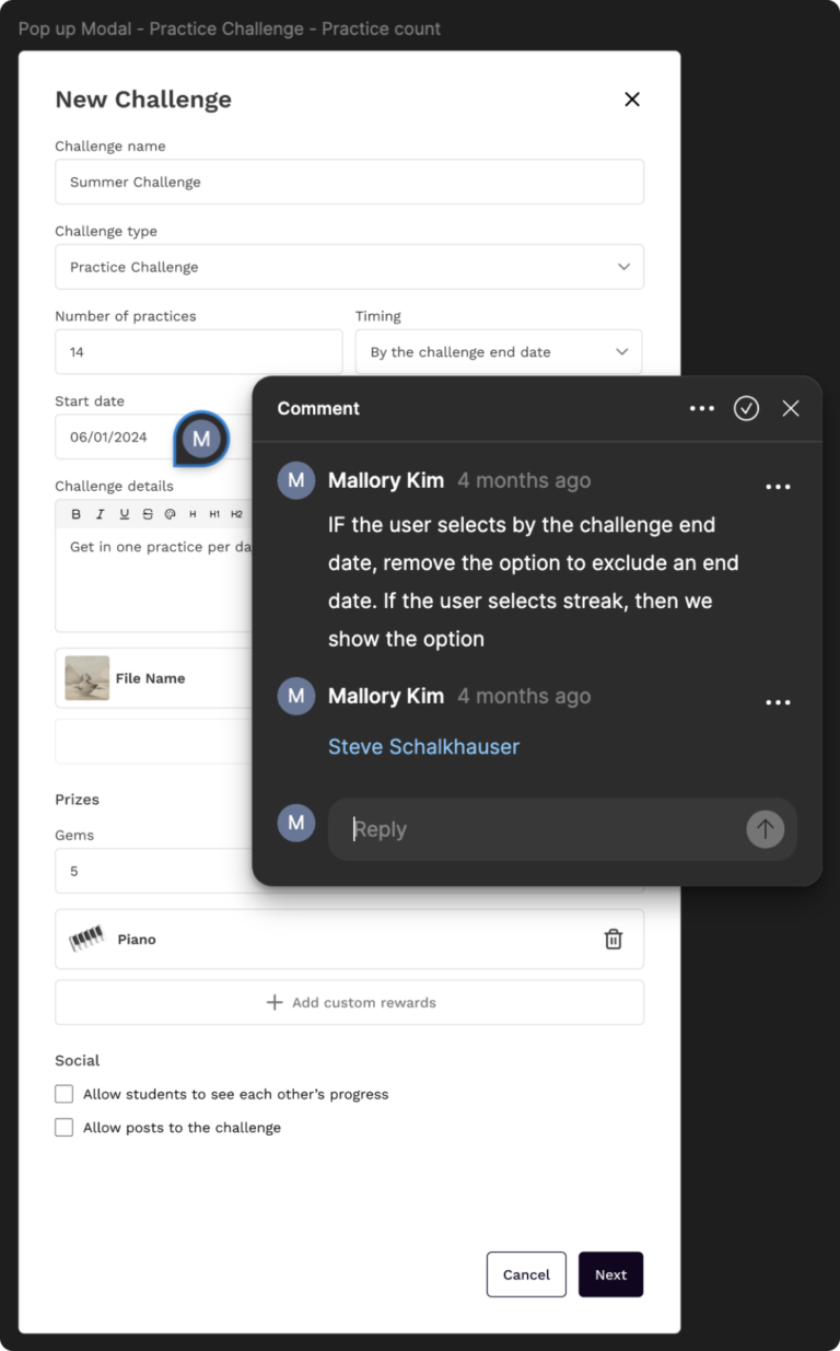
In my design process, I usually create detailed design documentation for engineers as I go. However, given this client’s limited budget, the developer and I opted to use Figma comments to communicate design intentions and interaction details. This approach worked well since we had collaborated on previous projects, allowing us to save the client time and resources.
Design Library
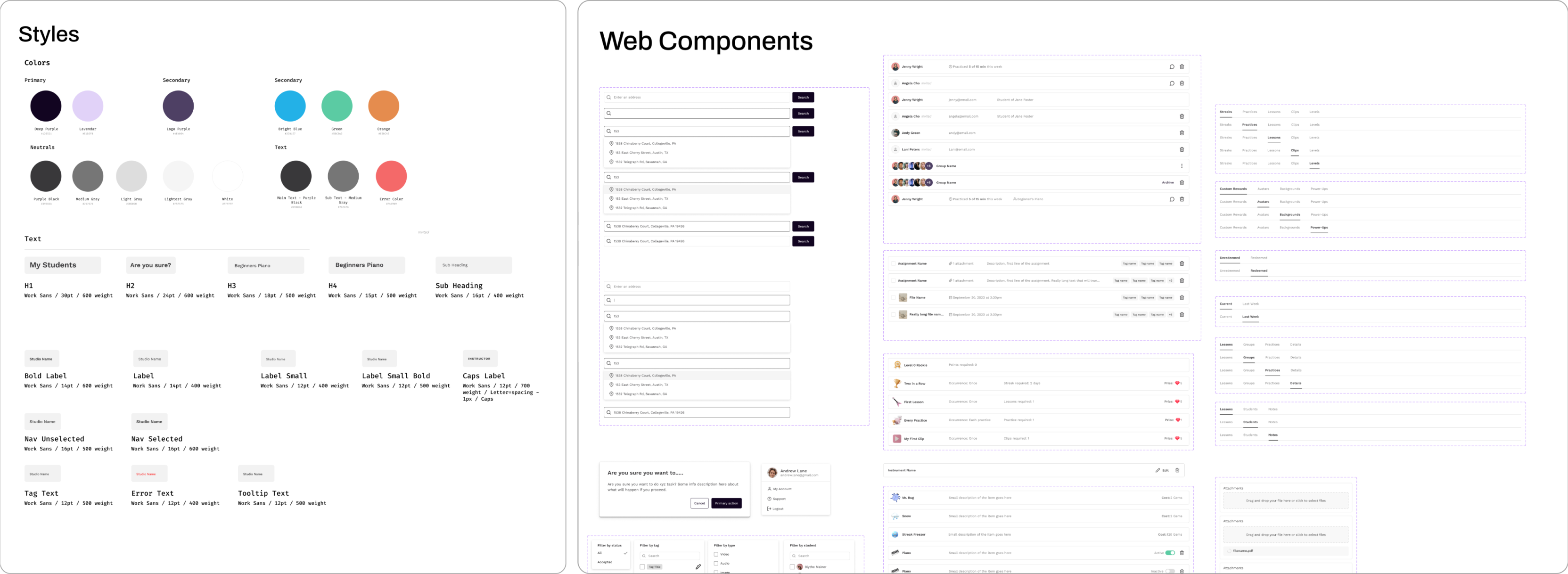
As I moved into high-fidelity design, I built a comprehensive component library for the project. This allowed me to work efficiently and quickly adapt to any changes, avoiding the need to update components across hundreds of screens individually. The component library was also highly beneficial for the engineers, providing them with a single reference for specs and different component states, significantly streamlining their workflow.
Design Feedback
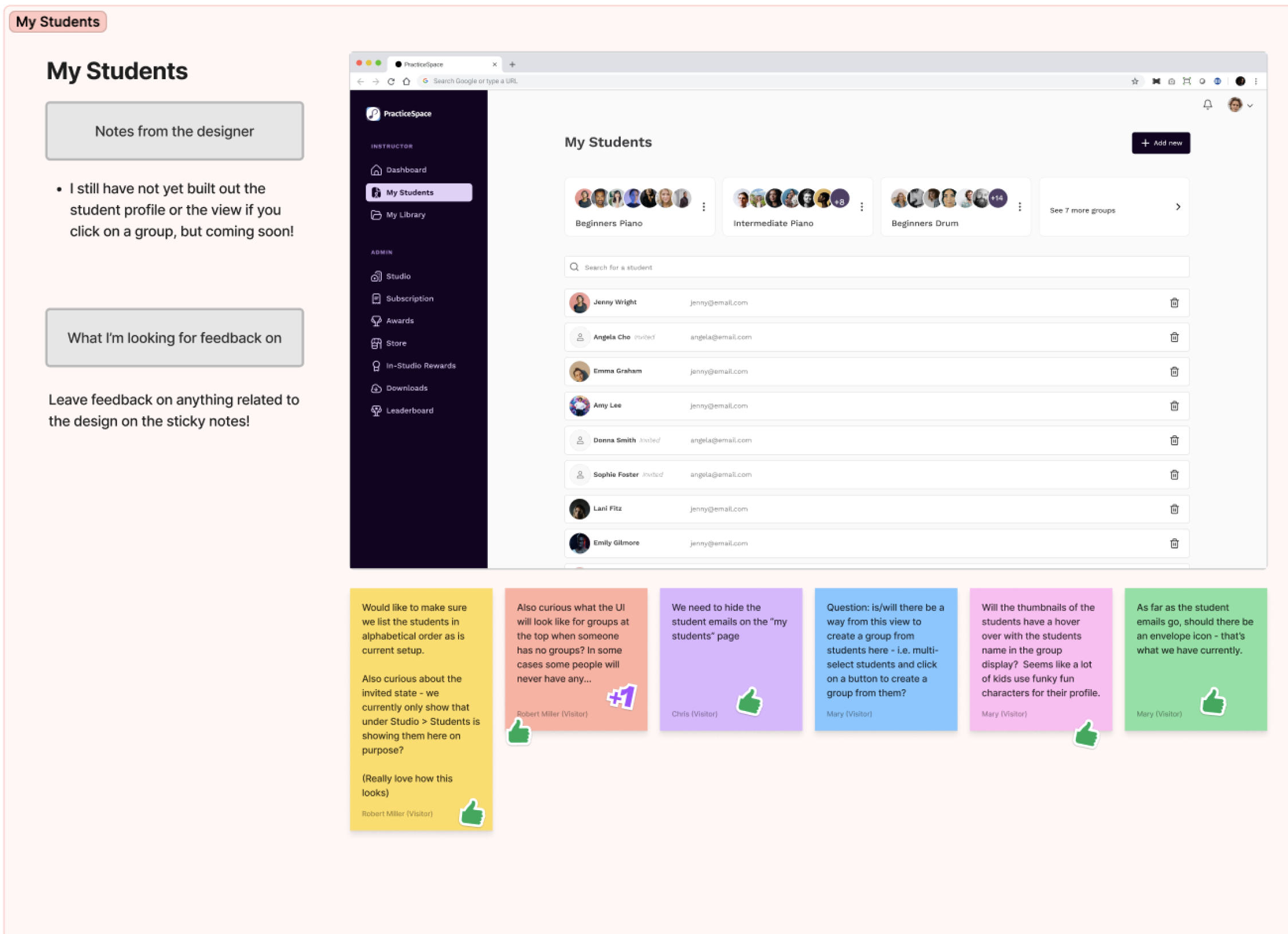
The Practice Space team operates remotely and is geographically dispersed, so throughout the project, I created boards in Figma for team members to provide feedback on various app screens and designs. This setup allowed everyone to review the designs and my accompanying notes at their convenience, leaving feedback on sticky notes for me to incorporate into the final designs.
While this method of gathering feedback doesn’t always work effectively, it proved successful for this team because everyone was diligent about reviewing the designs promptly and sharing their insights. This collaborative approach significantly contributed to refining our designs and achieving an outstanding final product.

